


Improving Sales Conversion through Research and Redesign
Introduction
Sales conversion is dropping, cart abandonment rates are up, and User feedback reveals that users are confused, unassured, and struggling to purchase bikes at Wildtire Bikes. To improve these key business metrics, I identified the user flows with the most urgent redesign needs and focused there. Those flows are;
Shopping or Browsing Experience Flow
Checkout Flow
Comparison Feature Flow
Menu Navigation
In order to improve the User experience and improve shopper conversion, I needed to focus this redesign on the ‘browse to completion of checkout’ flow. A more simplified and informative experience was a top priority.
My Role: In this redesign project, I acted as lead UX Researcher and Designer, UI Designer, Usability Tester and Moderator.
OBJECTIVES
Primary research from the Wildtire Bikes team identified the following Business metrics to be addressed.
50% of users open on average 7 item pages and then abandon the site without moving any items into the cart.
70% of users who place an item in the cart do not purchase.
Data shows that users primarily abandon the cart at the registration page.
Initial feedback suggested a confusing shopping experience and difficulty navigating the site as well as difficulty learning about the products.
PROBLEM SPACE
The overarching problem with the current site was poor sales conversion and a confusing shopper experience.
To identify and solve the problems more specifically, I crafted the following How Might We statements.….
Give bike shoppers a more detailed and knowledgeable resource to buy bikes online
Replicate or imitate an In-store shopping experience
Increase shopper confidence when buying high-price-point items online without tangible product interaction
Primary Research
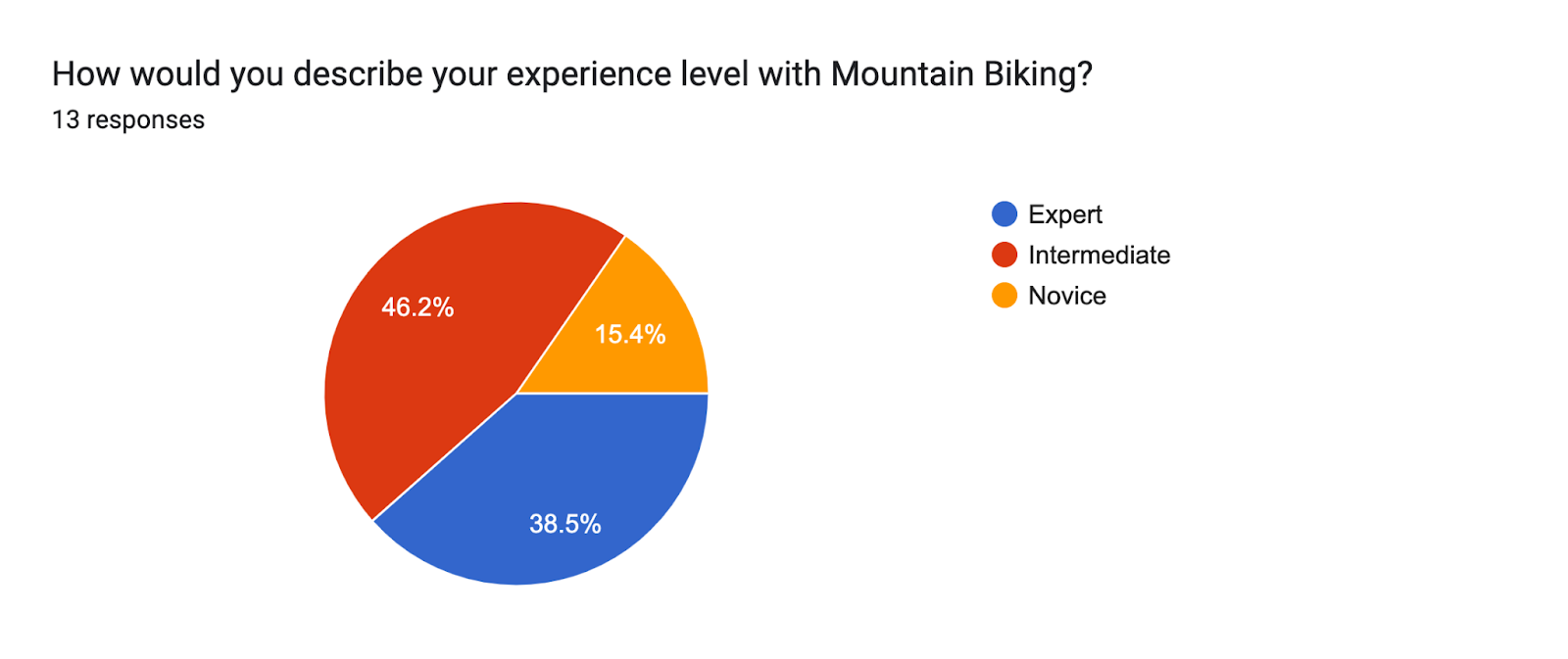
I chose to gather primary research through a comprehensive survey method. Using Google Forms, I was able to send out 20+ surveys receiving 14 responses which were all from people with moderate to expert-level experience both in mountain biking riding and purchasing bikes.
BY THE NUMBERS…
25-30 Questions (based on answers).
20+ Surveys sent
14 Responses
24-65 age range of respondents
SURVEY DATA & FINDINGS
I compiled the data from the Primary Research Survey into several charts and diagrams. These represent a quantitative approach to the survey which i took through short-form and multiple choice questions. For the open-form questions in the survey, I synthesized my data into a research summary.
-
![]()
Most Valued Bike Specifications
-
![]()
Shopper
-
![]()
Product Page
-
![]()
Cart
-
![]()
Category Overview


PERSONA
Roughly 27-45 year old, typically male, and has a decent disposable income. Likely to not be an ‘Early Adopter’ of tech, but does like to loosely keep up with trends and improvements in biking technology.
While usually a weekend rider with their ‘biking buddies’, our persona is a good Mountain Biker and is looking to upgrade to a better bike to tackle tougher, longer trails.
ONLINE VS. IN-STORE SHOPPING: A DILEMMA
Purchasing a bike online is a scary task. Buying a mountain bike is a special experience. It’s a product that requires proper fitting, lots of expert questions, side by side comparison, test rides, and detailed product knowledge.
Generally, more expensive purchases have higher levels of discretion and hesitancy. Transparency and confidence regarding the warranty, returns, and customer service is especially crucial in online
Bikers often know what they want to buy before they set foot in a shop or a website. They choose to buy bikes online because of the lower price point typically found with Direct-to-consumer bike brands
Survey data also revealed that Price, Drivetrain and suspension, Geometry, and weight were the most important product features my participants wanted to know. I will be sure to make these specifications salient through my designs.
USER PAIN POINTS
Product Comparisons
Warranty, customer service, replacements, and repairs
Fit assistance (when choosing the size of the frame)
Actual availability
Most desired product specs
LEARNING FROM INDUSTRY LEADERS
In order to get a better understanding of the industry and to discover the make-up of an engaging retailer web app experience, I sought out some of the top performers in the industry. I chose to focus on mountain Bikes specifically, which led me to a choice between Mountain Bike Retailers (Jenson USA, REI, Backcountry, Etc) and Bike Brand sites (like Specialized and Canyon).
Throughout my research, I discovered some significant differences in the User Experience and overall User Interface between the two business models.


BROWSING & SHOPPING EXPERIENCE
The overarching objective of this redesign is to increase revenue by improving shopper conversion from browse to completion of checkout. To better understand the browsing and shopping experience for purchasing a mountain bike online, I chose to study Specialized, a bike manufacturer, and JensonUSA, a massive online bike retailer.
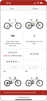
PROS: Navigating was easy, especially if you know what you want. Users need some sense of what they want when entering the site. Big emphasis on Price/sales throughout flow.
CONS: It took 6 clicks/screens to get to a product page while searching through the menu and categories.
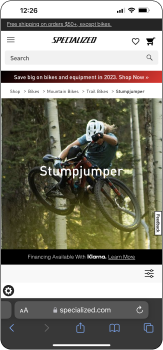
PROS: Excellent branding and aesthetics. Excites/entices user. Search flow long, but fool-proof. Product page focuses on product details/features.
CONS: Took 7 screens to get to product page. More industry terms and jargon. Mountain bike categories (trail, cross country, downhill) confusing to new riders. Browsing requires lots of backtracking
Design Thinking & Rationale
Reduce number of clicks required. While these retailers carry a large assortment of bikes, this project will be dedicated to one specific type of bikes. This will reduce the steps needed to get to a product page. Also, Create a quicker mode of category selection.
PRODUCT COMPARISON
Research shows that nearly 50% of users open on average 7 item pages and then abandon the site without moving any items into the cart. My hypothesis is that users are unable to determine which bike is best based on relative features. I decided to seek out a well-designed product comparison from Canyon, a successful player in the industry.
PROS: Canyon created an extremely simple and helpful interface for product comparisons among their products. Users are allowed to check a box beside each product they see (up to 3) and then can compare those head to head. This flow also allows users to flip their mobile devices into landscape mode for a more scannable and text-heavy viewing mode. All major product categories are collapsed but can easily be expanded across all 3 products.
CONS: This user interaction is heavy with text and reading. The mountain bike industry is especially full of technical terms and jargon that presents a challenging learning curve to new riders. Without a mode of explanation/knowledge of these terms or a base-level knowledge of bike parts and components, this feature is rather useless.
Design Thinking & Rationale
The comp chart has some long-form text segments which, when scaled down, become very hard to track and read. I noticed lots of Redundant data presented in the comparison table. Using ticks or lines to show repeated/same information (for example, Frame Material for all three bikes is Carbon Fiber CF). That could either be removed or abbreviated across all 3 columns
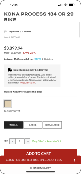
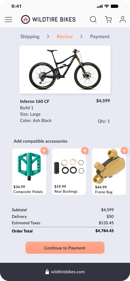
CHECKOUT FLOW
A crucial part of this redesign project is the checkout flow. Because data shows that users primarily abandon the cart at the registration page, it was obvious that a more straight-forward checkout experience was necessary. Another business objective was to increase email collection. Creating a guest checkout option would resolve some site abandonment issues as well as increase email collection. The guest checkout must capture email.
PROS: Focus on price again. Flow included upfront info about shipping and delivery. The guest checkout option is important. The order summary was reassuring
CONS: CTA’s blend in with Banner ads sometimes. Price emphasis and Sales incentive callouts (dark pattern) overpowered product information
PROS: Once a product is added to cart, the ‘add-on’ accessories pop-up shows matching spare parts specific for the selected bike. Clear CTAs
CONS: Add to Cart did not feel like a primary button design for a CTA. Somewhat subdued. Flow is long, although informative and not difficult.
Design Thinking & Rationale
Merging the strengths from these two examples would yield strong price callouts, clear CTAs, a quicker flow, a Guest check-out experience, product-specific price add-ons, and a clear Order Summary.
• KEY FINDINGS •
In the e-commerce Mountain Bike industry, there are 2 major camps. For my Industry research I studied Bike Retailers like REI and Jenson USA, and Bike Brands/manufacturers (who increasingly sell Direct-to-consumer) such as Specialized and Canyon. I learned some crucial differences between the two such as…
Bike Retailers have a much larger product inventory and emphasize price, promotion, and discounts above all else
Bike Brands have greater product specifications and an abundance of detailed product information
DESIGN
USER FLOW MAP
I wanted to build a concrete foundation at the start of my design process and focus my efforts on the most high-priority user flows, as defined by our business goals and metrics. The critical flows in the redesign project are;
Shopping or Browsing Experience Flow
Checkout Flow
Comparison Feature Flow
Menu Navigation
Beyond this, beginning with a comprehensive user flow chart allowed me to anticipate several aspects of this project, including the magnitude and areas of focus. I knew that in addition to my critical flows, I wanted to design a natural and comprehensive flow for testing and prototyping.
Click images below to enlarge.
WIREFRAMES
After building a framework for the navigation and architecture of Wildtire Bikes, I built low-fidelity wireframes as the skeleton for the site.
-
![]()
Homepage
-
![]()
Product Page
-
![]()
Comparison Chart
-
![]()
Cart
-
![]()
Category Overview
-
![]()
Filter Pop-up
-
![]()
Menu Navigation


USABILITY TESTING - WIREFRAMES
Findings from testing the Wireframe Prototype
In order to create a better digital product for customers, we are testing 5 target users on a redesigned wireframe prototype that has been designed with specific solutions and improvements in mind. For the wireframe usability testing sessions, I plan to interview five people and have each complete four tasks with our low-fidelity prototype. I had our target users to complete the following items on the task list below.
TASK LIST
Enter the site and browse/find a specific product
Add a product to your cart
Compare 2 products
Checkout as a Guest while entering an Email address.
CONFIRMATIONS
Layout made identifying products easy
Small listing of product specs on the product detail page was well-received
Checkout flow was usable
LIMITATIONS
Incomplete prototype
User memory (comparing this prototype to their memory of other checkout flows)
PARAMETERS
3 Participants
Age range 29-36
Beginner Mountain Bikers
CONTEXT
I conducted each test lasting no more than 20 minutes apiece. Each test will begin with a 5 min warm-up period to familiarize the user and create an atmosphere of comfort and honesty. The Usability portion will follow, lasting approximately 10 min. Testing will conclude with a 5 min debrief that includes some Q&A, as well as expounding on any observations seen during testing.
• KEY FINDINGS•
The design was not conducive to beginner mountain Bikers as the initial impression was specific bike types rather than a browsable shopping experience
The initial Browsing flow was designed for knowledgeable shoppers, less so for research.
Menu Navigation, while navigable, was not used
Information Design/Product categorization was unclear and hard to follow
Initial design was too dependent on imagery/color for navigation
NOTE: All iterative design changes reflected in High-Fidelity Prototype
“I’m not really a big mountain biker so I wouldn’t really know where to start. Probably just by looking around at bikes, I guess.”
VISUAL DESIGN STYLE
& BRANDING
Color Scheme

Typeface
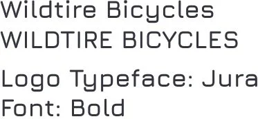

Company Logo

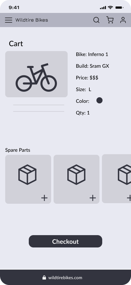
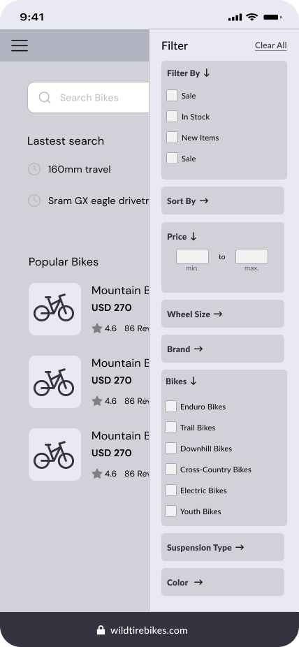
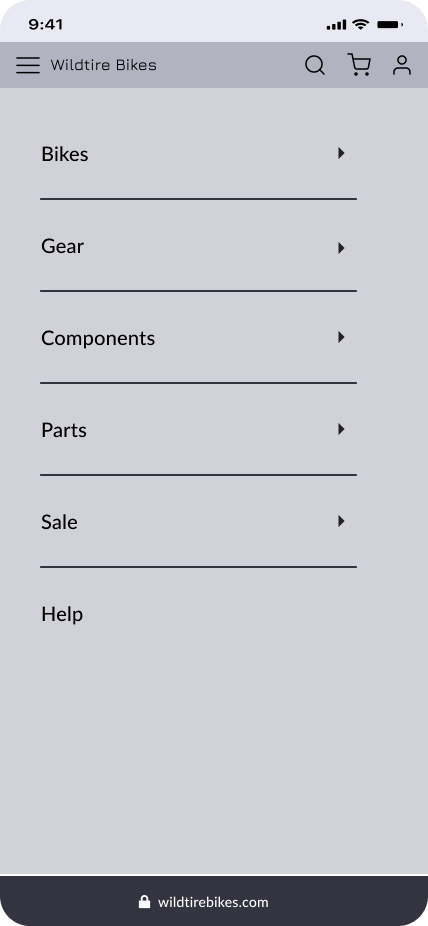
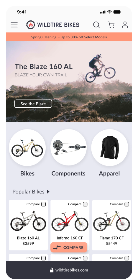
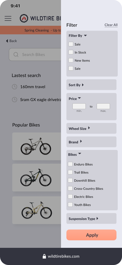
HIGH-FIDELITY PROTOTYPE
With a visual style and design system in place, I added the design elements to the low-fidelity wireframes to add delight to the structure. See Carousel below for still images of prototype.
-
![]()
Homepage
-
![]()
Product Page
-
![]()
Cart Review
-
![]()
Cart
-
![]()
Category Overview
-
![]()
Filter Pop-up
-
![]()
Navigation Menu


USABILITY TESTING - HIGH-FIDELITY PROTOTYPE
Testing
To test the usability and efficacy of the new High-fidelity prototypes, I gave my Test Participants the following task list to complete while I observed
Task List
Browse for a new bike: I want to understand the current user experience of browsing for a product.
Use the menu navigation to find a product: Search for a specific product but use the menu navigation tools if not already used
Compare 2+ products: View the results in portrait mode and landscape mode
Checkout: Complete the checkout flow as a guest until you reach the confirmation page
Add product to Cart and View cart: Add a product to your cart and then proceed to checkout
Parameters
4 Participants
Ages 25-63
Both Beginners and Intermediate Mountain Bikers
Limitations
Incomplete prototype
User memory (comparing this prototype to their memory of other checkout flows)
Compare feature was well-received although
Filter Modal static
Confirmations
Layout made identifying products easy
Small listing of product specs on the product detail page was well-received
Scalability was greatly improved
• KEY FINDINGS •
Information Design/Product categorization was still unclear and hard to follow
FAB was unclear, was unused. Users were deterred from using due to lack of clarity
Prototype reused some images which made page navigation more challenging. Users were confused about where they are
Hesitation around interaction with Frame Size selector buttons. Users knew that they were sizes, but thought it was page content rather than an interactive button
Need to add ‘Cart’. Navigating to cart or checkout flow was limited.
Guest checkout was clear, obvious, and frequently used
Key components of Checkout flow were easily found/interacted with (add email, Shipping options, Add accessories, grand totals, etc
Filter modal, not scalable
Color selector buttons were very usable, although the image contrast was so subtle that some users didn’t know it worked. → Improve user feedback
Inconsistent button shape, weight and size
NOTE: All iterative design changes reflected in MVP Prototype
“That button (FAB) looks really pretty but I’m afraid to touch it because I don’t know where it will take me.”
VALIDATE
DESIGN RATIONALE:
Overall, I needed more consistency and scalability to my design. While I designed Wildtire Bikes for a more knowledgable User, I could have easily expanded my reach to cover a broader range of shoppers without compromising any focus on my target User. From this, I knew I needed keep my shopping experience simplified and allow options within the navigation to accommodate different types of shoppers.
On the more practical hand, I learned an important lesson about prototypes — I reused some stock images throughout my prototype that resulted in User confusion. A user would quickly identify an image and relate it to their current place on the app, however, when I reused an image twice, the user lost their place and took a small amount of time to get back on track. This was affecting the outcome of my testing and creating a slight inconvenience but ultimately hindered the User Experience. From this finding, I knew I needed to not rely on imagery to assist with navigation, improve the visual hierarchy of each page to be clearly distinct from another, and that a prototype must still be not skip steps.
ITERATIONS:
Dynamic FAB
Simplicity and consistency around CTA buttons and functions
Added a Cart page
Prototype in Motion
Comparison Feature
Comparison Feature (Viewed in Landscape Mode)
Menu Navigation Flow
Browsing Experience
Checkout Flow
Thank you for reading.
-Austin
Attributes to:
Specialized.com, Jensonusa.com, Canyon.com, Rei.com