


Mobile Application for Family Travel
A Case Study by Austin Meldrum
PROBLEM SPACE
Traveling with children can feel stressful, exhausting and downright demoralizing. I learned this first-hand during a trip abroad with my children and immediately saw a need for a sophisticated travel resource specifically from the perspective of parents.
SOLUTION
Trice was designed with the traveling parent in mind -- a community and resource focused on increasing the amount of quality-time spent while traveling by helping parents make better-informed decisions. The goal of trice is to instill a greater sense of confidence in traveling parents by giving them proven and supported ideas, recommendations, information, and feedback to plan and enjoy a trip that accommodates everyone in the party.
MY ROLE
My Role:
I conducted initial user research through surveys and interviews, defined personas and empathy maps to better understand our users, led the visual design process from sketches to high-fidelity prototypes and organized several Usability tests to improve and iterate upon our designs. I was the primary User Researcher, User Interface Designer, and even the first user.
THE DUALITY OF PARENTHOOD
Identifying the Problem Space
Being a parent is complex. Often, parents want to create memorable experiences for their children and enrich them with unique opportunities. But parents are people too and want to have some fun and enjoyment themselves. Traveling, whether a local ‘staycation’ or an excursion across the world, is a common place for these different interests to collide. When we try to plan for new and exciting experiences is often when power struggles occur.
My goal was to uncover the biggest pain points parents experience while traveling with their children the specifics and the details behind these travel struggles.
How Might We Statements.
Accommodate the needs of both parents and children traveling together.
Instill in parents a greater sense of confidence and control while traveling with children.
Make the family travel experience less stressful for parents with young kids.
Increase the amount of quality time families spend while traveling.
Help parents make better-informed decisions about travel plans.
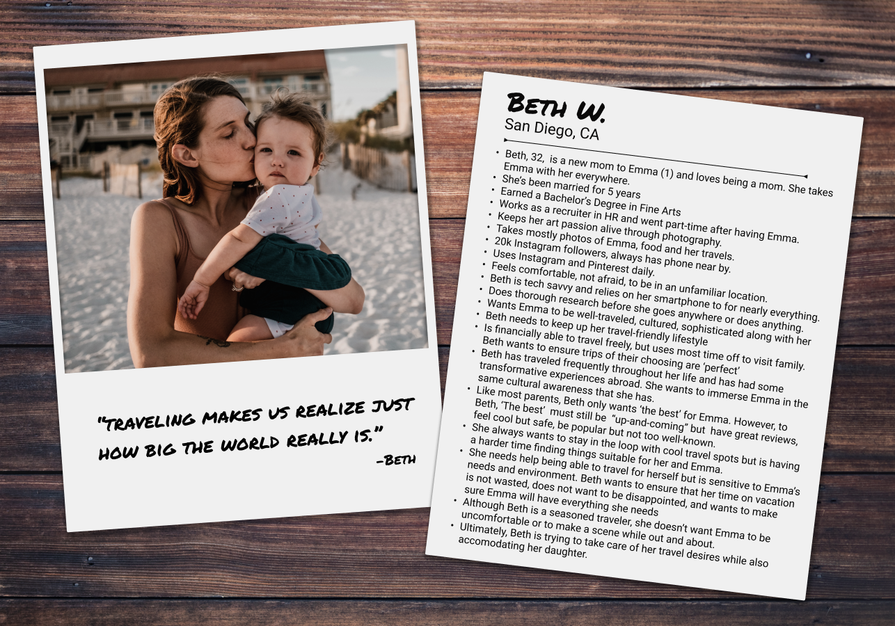
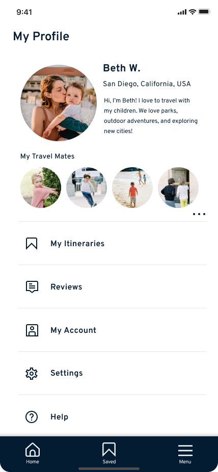
“Traveling makes us realize just how big the world is. I want my children to experience that.”
— Beth, 32
From the Ground Up
Insights from Primary Research

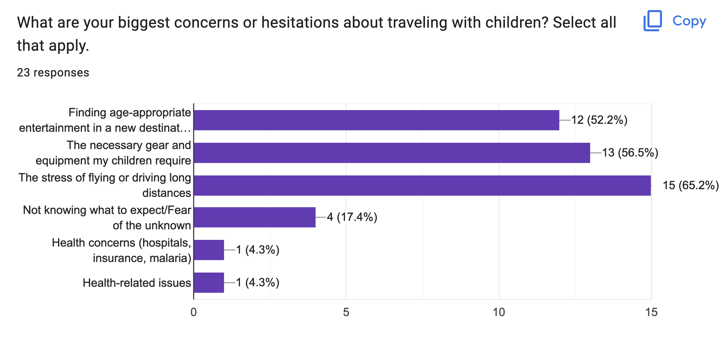
32 surveys sent

23 responses received

12 questions asked
For my first steps into primary research, I chose to begin with a Screener survey, aimed at finding quality candidates to help me learn more about this problem space. Survey topics include family dynamics, travel interests, vacation planning methods, technology use, and personality regarding planning a vacation.
Survey Response Statistics

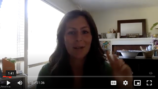
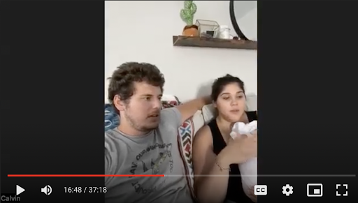
User Interviews

7 total participants from 29-36 years old.

6 User Interviews conducted remotely via Zoom.

Interviews lasted approx. 40 min.
12-18 questions asked.
Semi-structured interview style.

Participants located in Alaska, California, Colorado, and South Africa

7 children represented, from ages 2 months to 5 years.
Of the User Interview participants, one is a single mother and one is in same-sex marriage. Together, the interviewees have visited 6 continents and nearly 70 countries.


Interview Highlights
I want to enjoy traveling and see my child have fun too.
Family matters most.
I want to spend vacation time with my family, not wasting it “finding” things.
I want spontaneity. I want to have new, exciting experiences while still knowing what to expect, and we expect quality.
Confidence is everything.
Maintaining an existing lifestyle with new responsibilities
We’re going to travel anyway, we just want to make it easier
From Me to User
Data Synthesis to understand our User
Affinity Mapping
Our persona Beth is a savvy traveler and relies on tech to make travels with children exciting. When Beth is traveling with her family, she wants to maximize opportunities and receive a good return on money spent.
Overall, Beth wants to create core memories with her kids but somehow be adventurous as an adult while maintaining a sense of control and expectations
Empathy Mapping
Like most parents, Beth has a complexity of needs and wants. As a parent, she wants to continue a lifestyle created before having kids but needs to adapt to her new responsibilities.
Beth sees travel as essential. It’s a way to build core memories with her family and strengthen relationships with her children. She also considers travel as quality time and a gesture of love.
Persona
As I began to synthesize my data, I began coding on a digital Sticky wall. A thorough thematic analysis led to findings about the User’s main motivations for travel, resources for planning travel, common stressors, goals, current practices, and more. Next, I wanted to correlate the Who, What, Where, and When responses
My goal was to find answers to some of the big picture questions: Looking for friction points big and small, current solutions, and the ‘How’ and ‘Why’ answers.
User Story Highlights
Insights Straight from the User’s Mouth
Search

Users needed the ability to search for ‘things to do’, be it restaurants, hikes or local playgrounds. They wanted to be able to search in places they were familiar with and places they hope to travel to.
My User interviews also revealed that a map-based search platform is a familiar and often preferred method to conduct travel research. Users emphasized proximity as a crucial part of their planning methods, as parents like to know how far from the safety of their lodging they will venture out with their children.
Plan

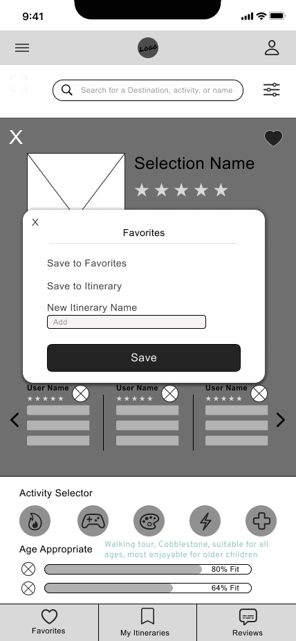
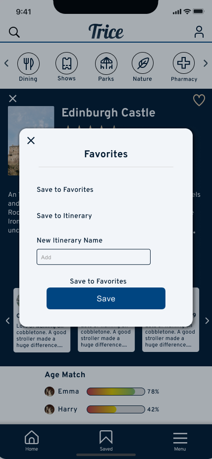
In conjunction with searching, it was evident that Users also needed a resource to help with planning. Users mentioned the power in being able to ‘Save’ or ‘Collect’ content during their searches, and in accordance with Jakob’s law, Users wanted these planning methods to work similarly to other sites they use like Pinterest, Instagram, and Airbnb. This led to the inclusion of the ‘Saving Pins’ and ‘creating Itineraries’ features
Confirm

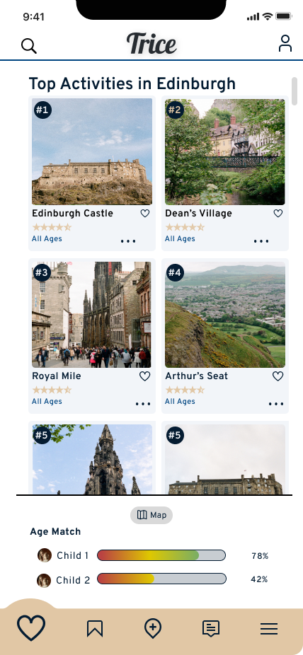
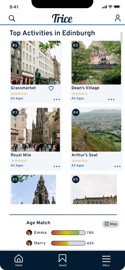
Parents usually had a rough idea of what they wanted to do while traveling, but when traveling to new or unfamiliar destinations, Users wanted extra support or confirmation that the decisions they were making would be ‘worth it’. This led me to emphasize a ‘Parent perspective’ in designing Trice. These findings also led to the design of 2 other features - Parent Reviews and the Age Match feature.
Findings from Primary Research
Managing Expectations
Fulfilling multiple needs and wants
Decisions supported and validated
Flexibility to plan around children’s schedule
Finding a variety of activities
have ‘unique’ adventures
Leading to Design Decisions
Emphasis on Parent Perspective
Age compatibility feature for specific activities
Reviews from fellow Parent Users
Planning and Saving capability
Primary search function with filtering
Focus on uncommon and individualized attractions
Evolution of Design
A Journey from Sketches to Prototypes
I wanted to implement my synthesized data and create an evidence-based design that would serve the interests and struggles of our persona.
Having gathered some key insights from my primary research, I learned that users needed a few simple functions as the foundation of the app. the ability to Search, Plan and Confirm.
These 3 insights became the pillars of my design process.
Sitemaps and Red Routes
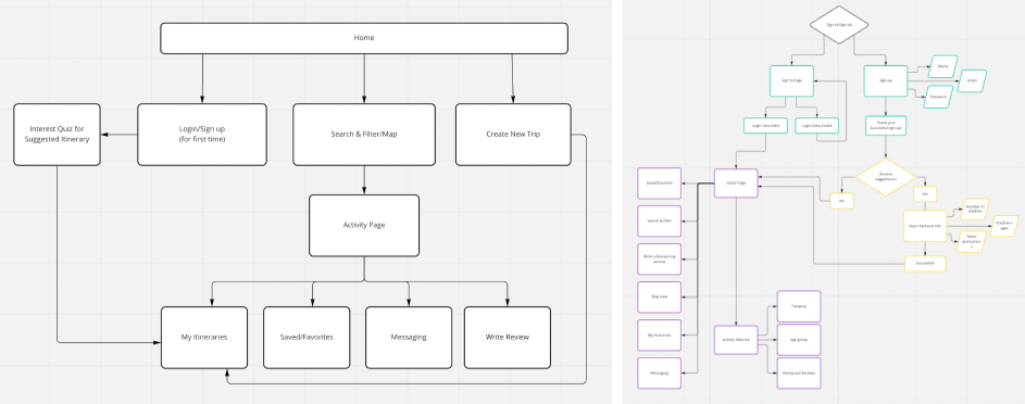
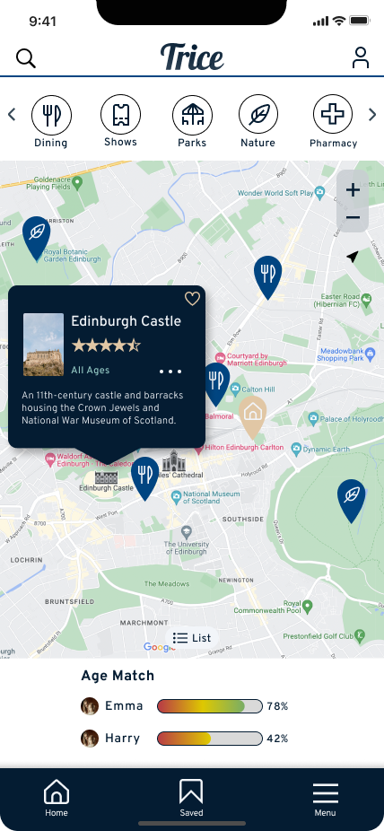
I wanted Users to be able to Search, Plan and Confirm within 2 clicks of the homepage, thus I chose a geolocation-based Map would be the main screen and main navigation point for the app.
Sketches
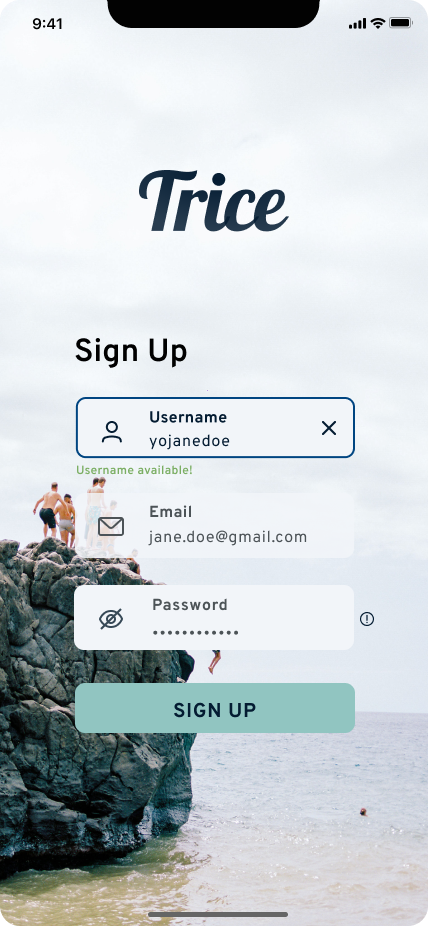
I quickly realized that in order for the Age Match feature to work, the app would need the User to input some information about their children and travel interests. This led to me to include an optional survey in the First-Time User flow. Once completed, the Age Match feature would be able to operate off of the User’s information.
Wireframes
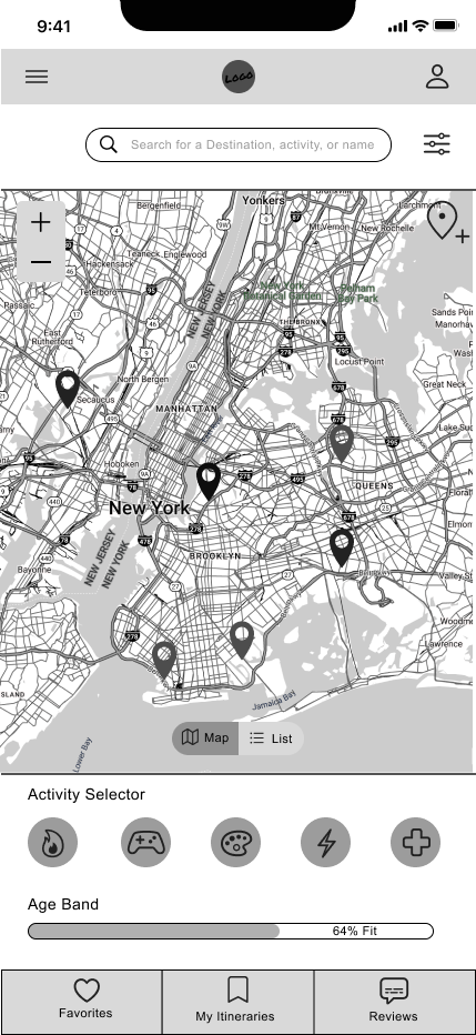
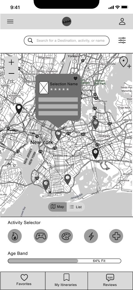
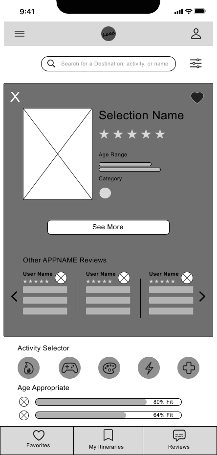
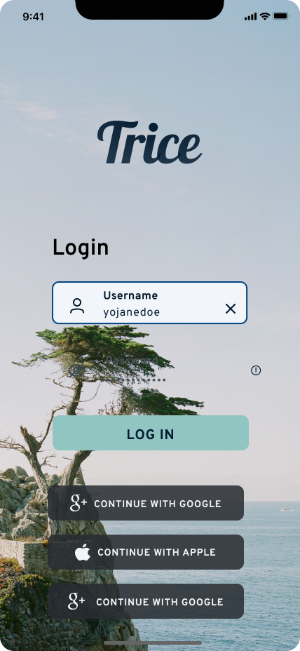
The wireframes captured my 3 design foundation pillars with a Map and Search bar, a Save feature included in the bottom navigation bar, the Age Match feature element on the main display, and quick access to Parent reviews after one click on a Pin Modal.
Wireflows
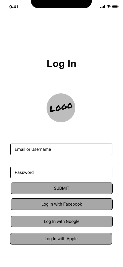
I added Navigation and animation to my Wireframes to create a Wireflow, with which I would conduct initial Guerrilla-style testing. I led with a Log-in screen into an FTU Flow of the optional Survey. the Map would act as the homepage with Pin modals, itinerary creation
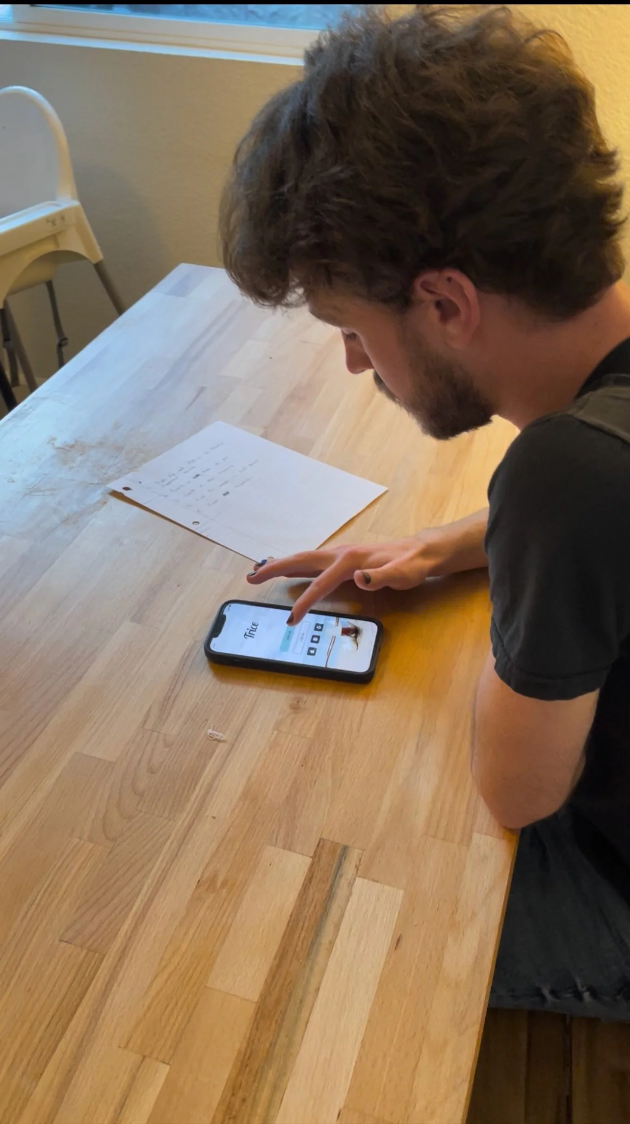
Guerrilla Testing
Wireflow User Testing
After I conducted a round of Guerilla Testing with my Wireframe prototype, I realized a few things; Icons are recognizable but can be misinterpreted. Words are misinterpreted less often. Together, icons with accompanying text are appealing and unmistakable.
Simple usability starts at the very beginning of the design process. It’s hard to go back and simplify a busy or complicated design later on.

Usability Testing Task List
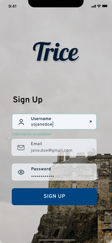
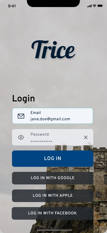
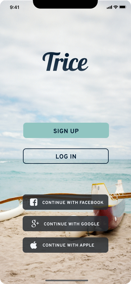
Sign Up
Favorite a pin in Manhattan
Return to Map
Create an Itinerary
Log in and View your profile
“It’s too busy, but luckily I recognize some of these pictures.”
— Pete, 60
First Iteration
-
![]()
Homescreen without Search Bar
-
![]()
List View


Usability Testing: Round 1
Testing with a High-Fidelity Prototype
From this round of usability testing, I learned several things including the role of iconography in usable design. Ideally, icons are easily recognizable, fun, brief, and commonly understood. Overuse can be confusing, and underuse can make for poor design.
I learned the importance of language and messaging. It needs to be clear, concise, and simple. Language needs to match the purpose of action, and pairs well with iconography to make an unmistakable interaction.
Finally, I saw my users heavily relied on a menu or navigation bar as an anchor or starting point from which they explored the prototype.
Heart vs Bookmark icons confusing.
Search and Filter - Findability
Hierarchy did not favor some features
Touch Points too small
Navigation and Menu need to be more prominent in Hierarchy
Key Insights
Limited Prototype build led to dead ends
Objective feedback
Strangers vs. Family/Friends as participants
Technical constraints
Challenges
“When it’s all just thrown at you without instructions, it can be pretty difficult.”
— Ben, 24
Second Iteration
-
![]()
Homescreen - Search
-
![]()
List View

Usability Testing: Round 2
Testing features and usability with a fine-tooth comb
For this round of usability testing, I wanted to focus more on the finer details and features of Trice since I felt my red routes were in a good place. I wanted to hone in on simplicity and ease of use — to make it fool-proof on every screen and interaction.
Key Insights
Reviews and icons needed more prominence in visual hierarchy
Greater use of ‘Pins” like Sharing, adding, etc.
Needed quicker actions like FAB, Menu modal
Gestalt Principles (Proximity and Similarity) with Filter and Search
Challenges
User focus on Usability Test, not business decisions.
Ensuring honest feedback
Testing Focus on UX/UI of app, not branding.
“I want like a shopping cart, so I can keep it and refer to it later — Next day, next week, whenever.”
— Kenneth, 60
Testing Overview
At the conclusion of my testing, I learned much about the challenges of testing. Creating an environment that is conducive to clear and objective interviews and usability takes a lot of skill.
I learned from my own mistake regarding data synthesis. When synthesizing my primary research findings into wireframes, I led with a prominent search bar feature at the top of the main screen. In a later iteration, I removed it because I didn’t see much interaction with it during usability testing (However, there are lots of other factors as to why this happened). In further testing, I saw the confusion User’s had without it and I knew I needed it back. After all, ‘search’ was a design pillar from the onset.
It is crucial to maintain an ‘MVP’ focus throughout the early design process -- starting simple and essential and allowing for additional, ‘fancy’ features later.
Keeping the design focus centered on the persona and their wants and needs is a challenge but will save lots of headaches and revisions later.
With MVP, doing less is more
Simplicity - More can be done later
Visual Hierarchy will navigate the user - Needed Improvement
Findings

Visual design did inspire travel
Red Routes laid a stable foundation for usability
MVP covered essentials and allows for additional building and growth
Confirmations

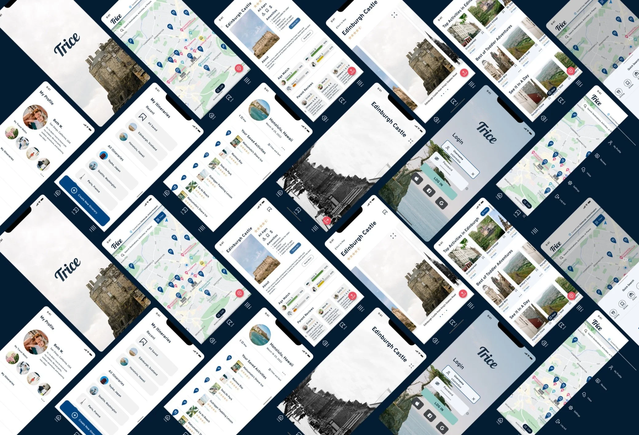
Latest Iteration
-
![]()
Homescreen / Map
-
![]()
Pin Dashboard


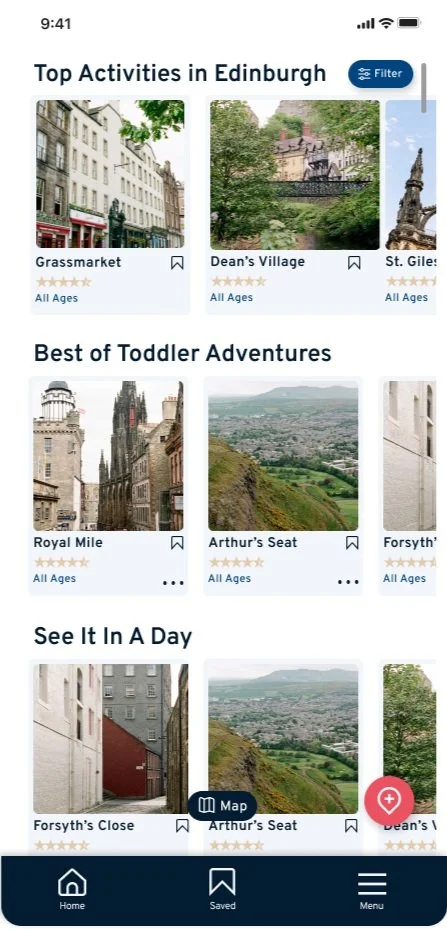

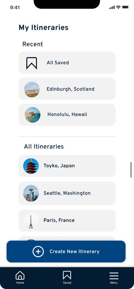


Prototype in Action
Full MVP Prototype walkthrough
Splash Screen to Sign-up FTU Flow
Searchability, Content List View, and Viewing Images Flow
Saving and Sharing
Menu, Profile, and Adding Content
Creating New Itinerary
Filter and Search Parameters Interaction
Visual Design System
While creating the design system and style guide for Trice, I wanted to focus on 3 main concepts:
Brand Identity inspires adventure, simplified.
Form and Function
Appeal and Delight
Moodboard
Trice understands and empathizes with traveling parents because we too are parents who love to travel. We want to help make travel decisions easier and more memorable, and we firmly believe that when it comes to enjoying an awesome vacation, knowledge is power.
We want to help parents have wonderful adventures with their children, have new experiences, make lasting memories, and do it simply.
Design Inspirations Include Airbnb Experiences, Yelp, and Trip Advisor
Color Palette
I chose a color palette inspired by the beach. I felt this brand identity resonates with travel, a ‘relaxing getaway’ and fits the theme of simplicity and convenience.
Imagery
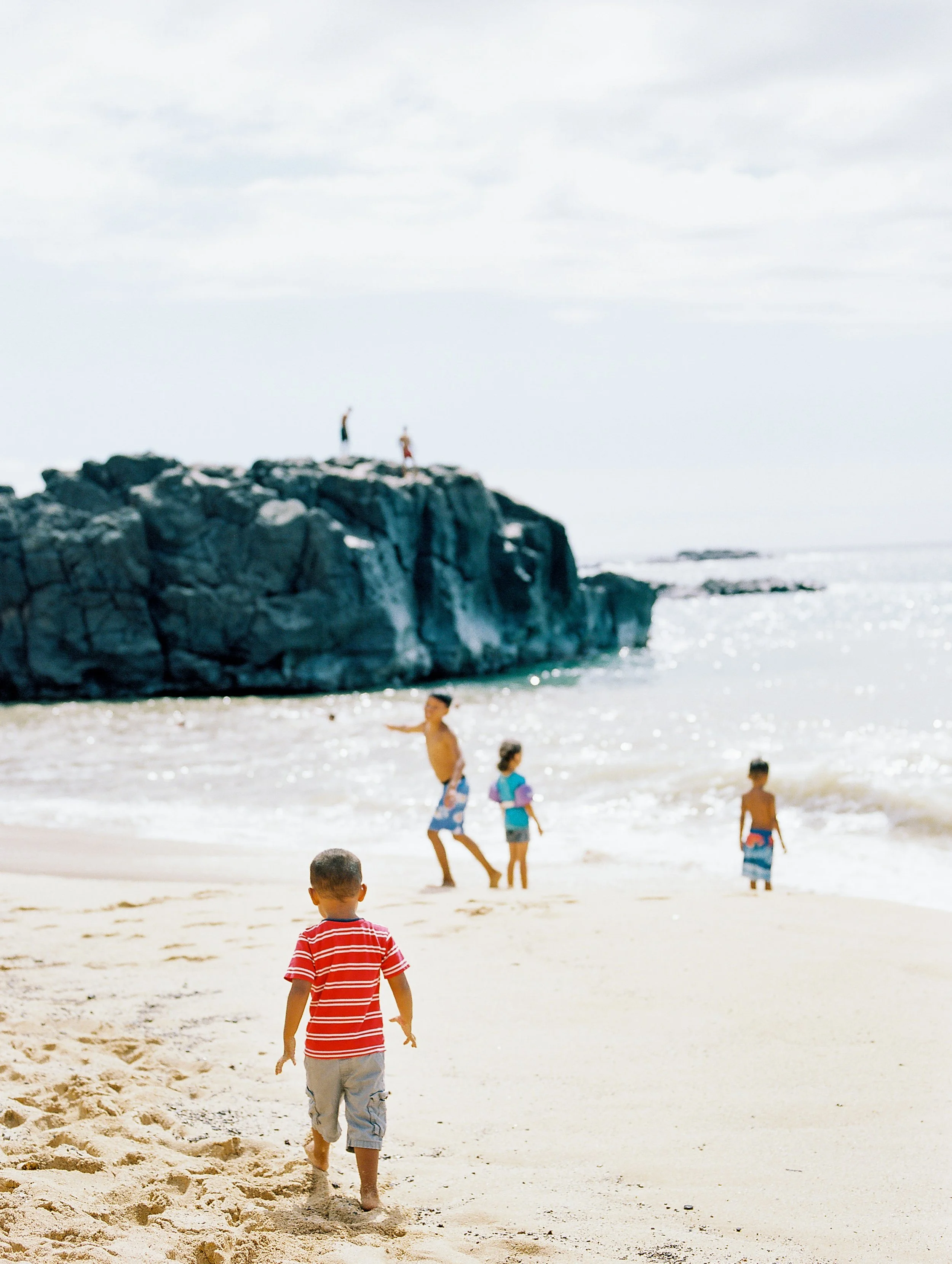
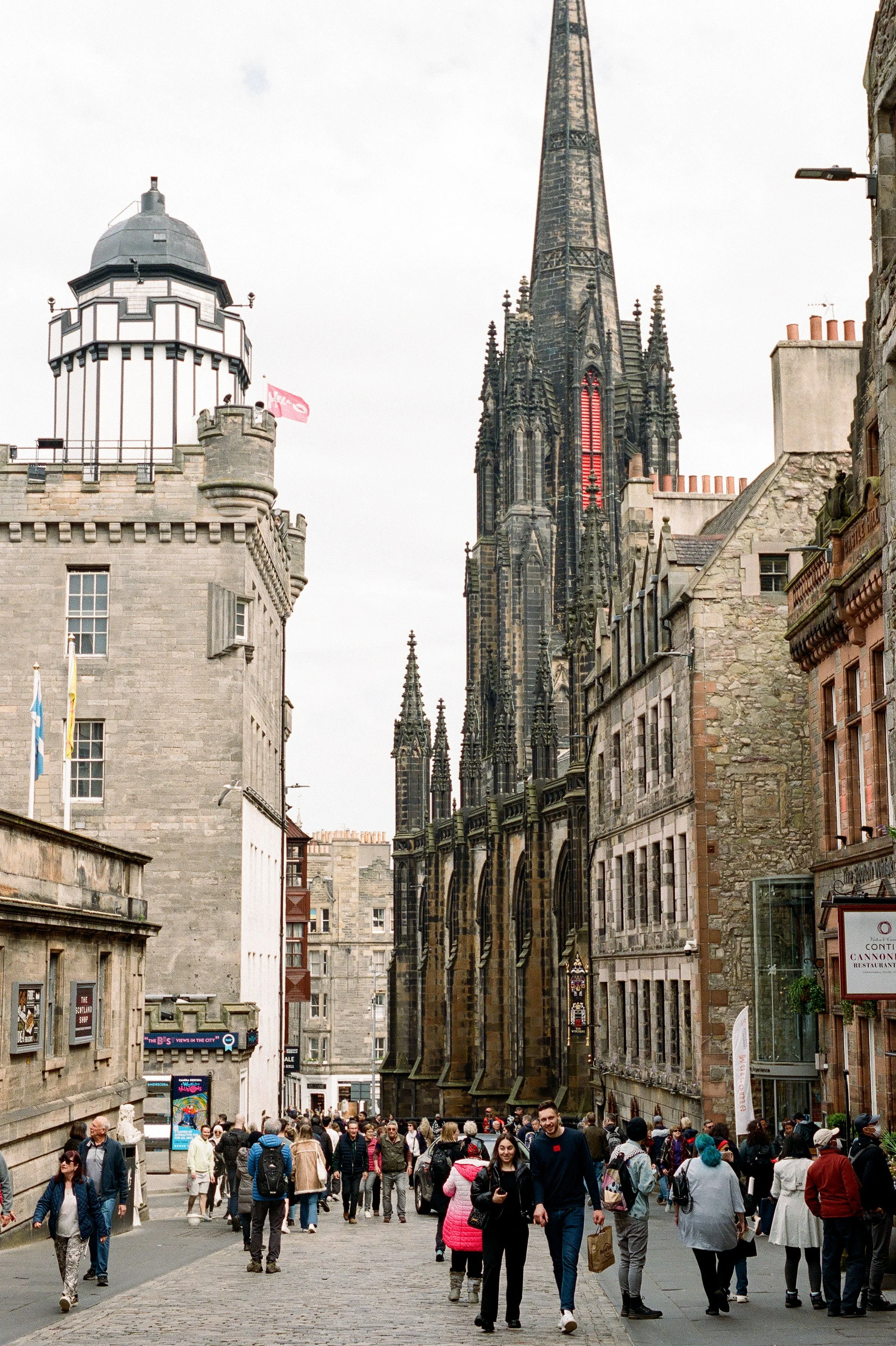
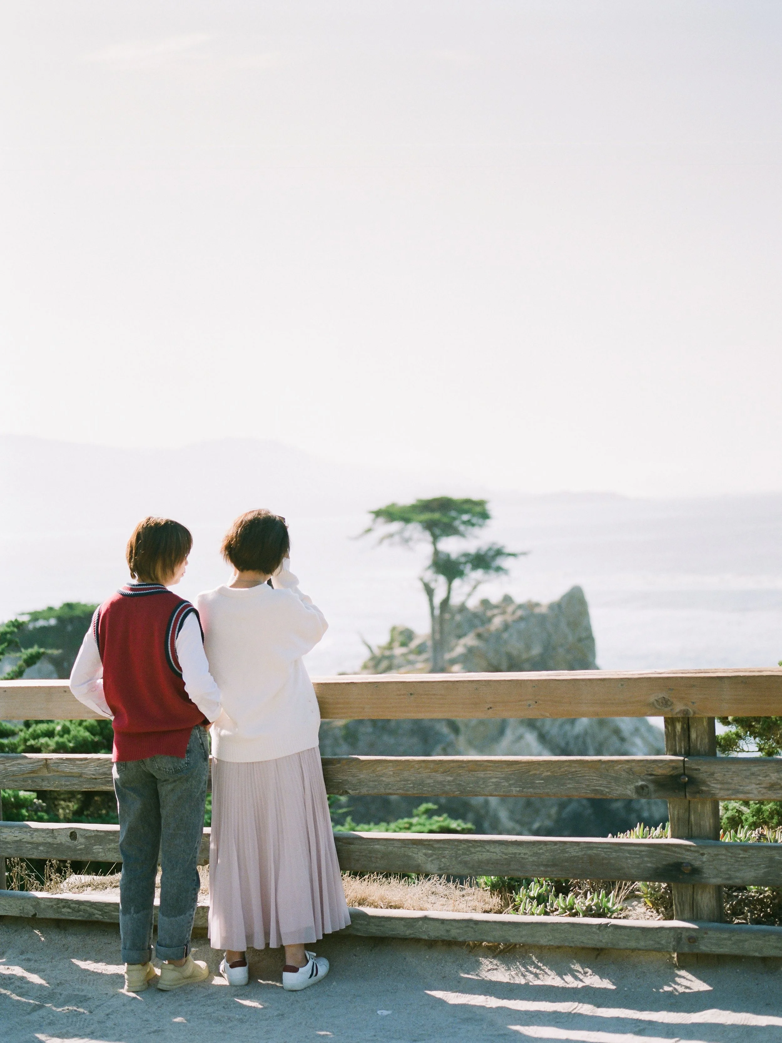
I chose images that capture the attributes; soft, delightful, warm, colorful, sophisticated, elegant, creative,
Imagery is to encapsulate the experience of being in this place, to inspire the viewer to travel, to show the magic moments of being somewhere new, and to instill wonder and excitement.
Photos courtesy of Breanna McKendrick


Iconography
Iconography was selected to be a bold but simple design with a lightweight and squared style. I chose this to convey sophistication and trust but with a playful and laid-back feel.
UIcons by Flaticon - Straight Corners collection
Typography
The typography was selected to be a clean and light design requiring low cognitive load that remains scalable from headlines to buttons to copy.
UI Elements
Iconography is a light-to-regular weight, outlined Icon shape with no fill. Icons are to have Straight corners, with simple representations and no ornate or elaborate detailing or additional filling or patterns.
UIcons by Flaticon - Straight Corners collection
Thanks for taking the time to read this story.
-Austin