

Savr Recipes
A Design Sprint Case Study by Austin Meldrum
Working as a dynamic team of one, it was my goal to conquer Google Venture’s 5-day Design Sprint by fully immersing myself in this high-speed design and learning experience. In conjunction with BiteSizeUX, I chose to solve a problem critical to users of the Savr Recipes app.
Introduction
Objective
Following GV's five-day design sprint model, I set out to enhance and improve the Savr Recipes mobile app by creating a more streamlined and simplified cooking experience.
My Role
For this project, while slightly modified, I am working as a team of one to recreate a realistic and effective Design Sprint experience. Using a UX Research brief from BiteSizeUX, I then synthesized all the qualitative data and assumed the duties of the UX Designer, Product Designer and UI Designer.
Problem
While several users have expressed great satisfaction and delight from the Savr Recipes app experience, many have complained and expressed dissatisfaction with the recipe instructions presented during the cooking experience itself. Oftentimes Savr users are left with a negative and stressful cooking experience that resulted in poor culinary outcomes.
Those frustrations were caused by
Inaccurate cooking times
Steps listed out of order
A lack of knowledge and resources
Feeling inadequately prepared to begin a recipe
Confusing cooking flow
Inefficient use of time
Solution
Working toward the solution, I created a few How Might We statements to paint a clearer picture of what exactly we are trying to solve. My goal was to narrow down a specific user interaction as the focus of this design sprint.
How Might We…
Create a hands-free app experience for users while cooking
Present better and more clear information upfront
Allow users to check their progress during the cooking flow
Make more time-efficient recipe instructions
Streamline the cooking experience for beginners
Day One
UNDERSTANDING
I started day one of the design sprint by debriefing on the UX research conducted by the Savr team with the goal of becoming become an expert on the problem. I did this by reading several transcripts and watching user interview videos of Savr users.
User Interviews
-
![]()
Dan
“I can see what the finished product looks like but I don’t know if I’m on the right track halfway through.”
-
![]()
Lindsey
“I like to be ready for the next step. Sometimes I’m standing around waiting and later realize I could’ve saved 20 minutes by doing something else.”
-
![]()
Anthony
“Sometimes I make a few small mistakes and I feel like everything is downhill from there.”
-
![]()
Anna
“When I feel steps are sprung on me…and that turns an enjoyable experience into a stressful one.”
-
![]()
Ron
“A lot of times I have to wash something midway through when I really didn’t need to if I changed the order of a few things.”
-
![]()
Maria
“I don’t like emptying my cabinets because I don’t know what I need or constantly washing my hands to use my phone.”
-
![]()
Sara
“I often see techniques I am totally unclear on… which kind of throws everything off.”
-
![]()
Sylvia
“Sometimes I have to re-heat a dish… that’s a bummer when you take time to make something fresh.”


Our Persona

Nick, 29
Los Angeles, CA
Behaviors
Cooks about 3x a week
Enjoys cooking and trying new recipes and thinks following a recipe is the best way to learn.
Doesn’t feel comfortable improvising on a recipe until he’s cooked it ‘by the book’ once.
Frustrations
Often unsure if he’s ‘on the right track’ while cooking.
Unclear on ‘what’s next’ and how he can prep a few steps ahead. Likes to be time efficient.
Gets stressed having to refer back to his phone.
Goals
He wants to follow a recipe easily and confidently so his dish comes out as expected
Nick wants the experience of trying out a new recipe to be challenging but fun - not stressful and chaotic.
Mapping
Once our problem was understood, I began mapping possible end-to-end experiences the user might have with Savr. I drafted four possible routes that helped our users have an easy and confident cooking experience.
Day Two
Now that I’ve identified my problem, I conducted a Lightning Demo and a Crazy 8s exercise to draw inspiration and generate ideas. My goal today was to build upon the maps made on day one and continue working toward a solution.
After researching several websites and mobile apps - both new and familiar - I came across 4 that had interactions or features that would help solve the problem my persona is struggling with.
SKETCHING
Hello Fresh
Content Overview
Serving amount toggle
I chose HelloFresh because of the automatic Serving Amount toggle. The user can easily switch the ingredient measurements based on the number of servings they wish to cook. This eliminates the need for User calculations which should make a more simplified cooking process and also reduce the potential for cooking errors from the User.
Ultimate Guitar
Auto Scroll - Interface for occupied hands
Ultimate Guitar is designed to be used by multitasking users. In this case, the user is playing their guitar strumming along to their guitar while learning a new song. This Autoscroll feature was immediately applicable to the Savr Recipes app as our users are interacting with occupied hands and automated navigation interaction would be helpful.
Food Network app
FAB as quick reference for Ingredients list
Ingredient Substitutions
The Food Network app was impressive to me for two main reasons; The use of a Floating Action Button as a quick reference for content found earlier in the sequence (in this case, Ingredients) and Ingredient Substitutions guide is a phenomenal design for edge cases as it accommodates more users and solves the problem of dietary restrictions as well as a lack of resources.
Kitchen Stories
Recipe Flow and Time Callouts
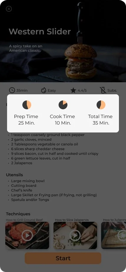
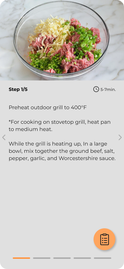
Kitchen Stories does several things well. The bold time callouts help the user be more efficient when cooking complex dishes. The pagination gave a good, visible progress indicator and the list of Ingredients and utensils needed per step provides crucial information. The interface is clear and visible from a distance
Tutorials and Step-by-step Ingredients list
The Kitchen Stories app’s ability to divvy up large lists of information - as recipes usually are— into smaller, more digestible bits of information is essential to helping Savr users have a better cooking experience. Here we see a beautiful and clear recipe overview as well as step-by-step directions.
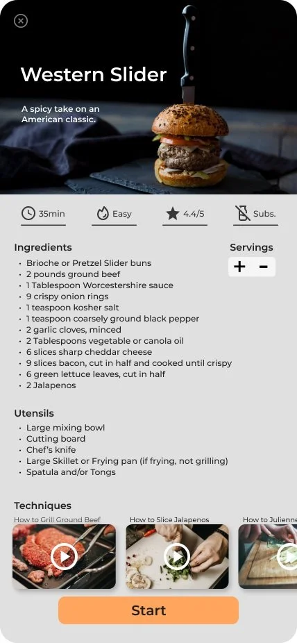
Recipe Dashboard
The dashboard has all of the key information needed to feel confident when deciding to begin cooking a recipe with out being overwhelming or unnecessary.
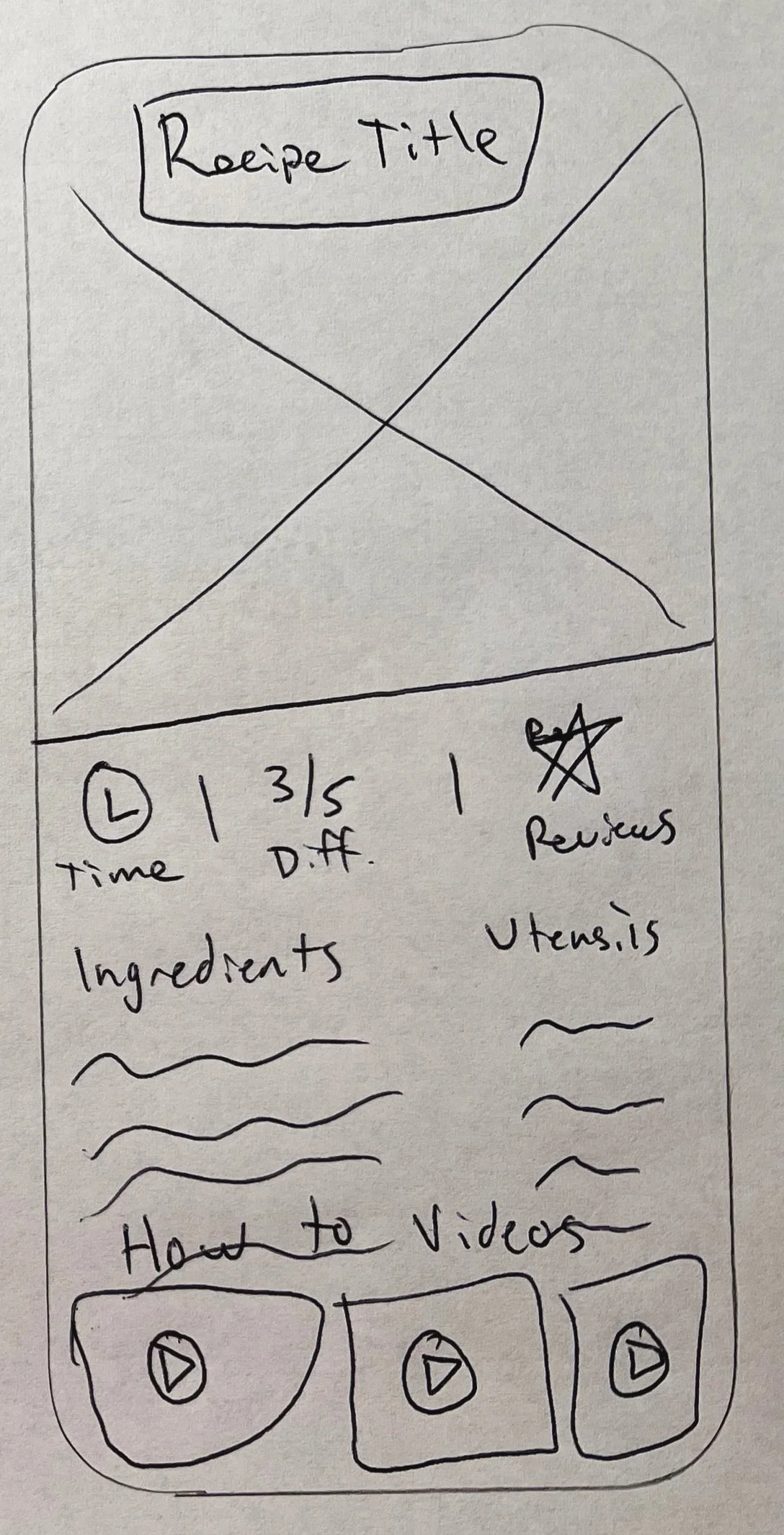
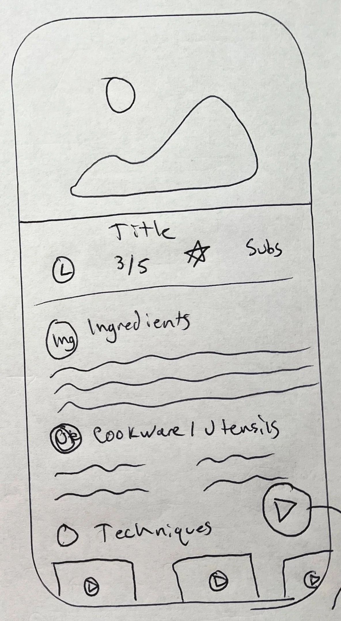
Critical Screens
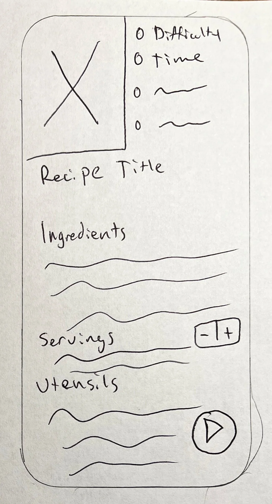
After I scoured the internet and found new inspiration, I sketched a Critical Screen, or the screen most important to our users so that they may accomplish our goal. I also sketched the screen before and after the critical screen to start building out our user experience.
Following the critical screen sketch, I conducted a Crazy 8s exercise and quickly drew 8 different versions of the critical screen. I wanted to implement some ideas and features found in successful cooking apps and create a patchwork of those interactions.
Rationale
I took the ‘goldilocks’ approach when choosing the critical screen — I wanted the design that was ‘just right’. I wanted a detailed image on top, as images are important to cooking, and I wanted the information to be listed in a vertical scrolling manner. This should encourage the user to read through chunks of key information before beginning the cooking flow. I learned from the user research that knowing cook times and all possible preparations were crucial in achieving a confident cooking experience and a delicious outcome.
Lightning Demos
Crazy 8s


Day Three
STORYBOARDING
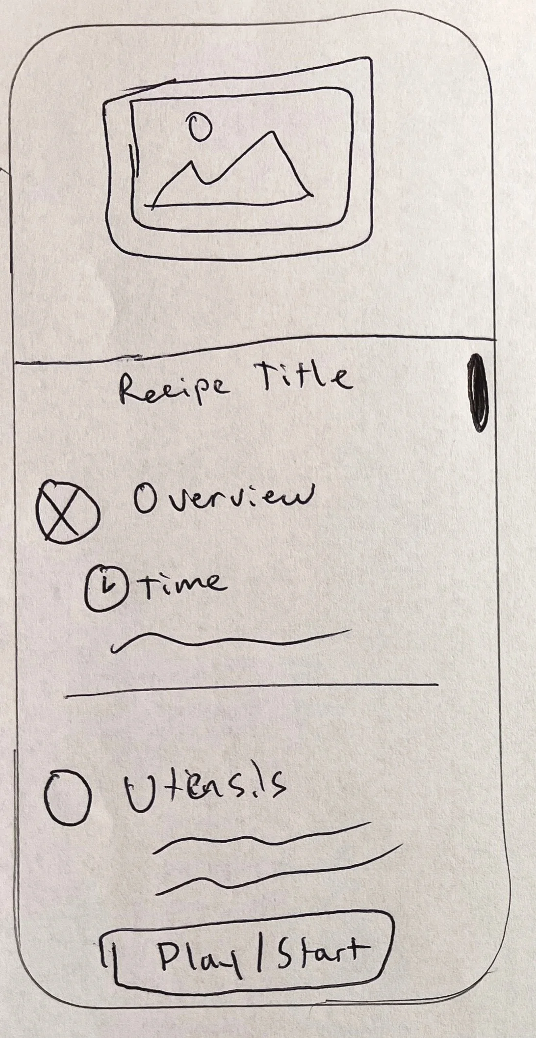
Using the wireframes and critical screen selections from Day two, I decided which iteration of my critical screen I thought was best for our users.
From there, I created a lightweight storyboard of the necessary interactions for the User to complete their task of cooking a delicious new recipe in a simple, timely manner.
I started with a hand-sketched storyboard to decide the user flow and the number of screens needed complete the end-to-end experience. Once I felt confident in the interaction, I recreated the sketches as a low-fidelity wireframe storyboard.
Goal
I decided to create a storyboard that could get the user from opening the app to completing the task of cooking a delicious meal. I had to fight off the urge to recreate and rethink the solutions I came up with yesterday. I was largely able to stick to the solutions created yesterday with only a few temptations and just a couple of additions.
My design goal was to have large touch areas, a simple interface, and a low cognitive load. I knew users would be looking at their phones from a distance and would likely have dirty or occupied hands so I tried to design knuckles or elbows, with visibility from a distance of 5-8 feet.
Storyboard


Day Four
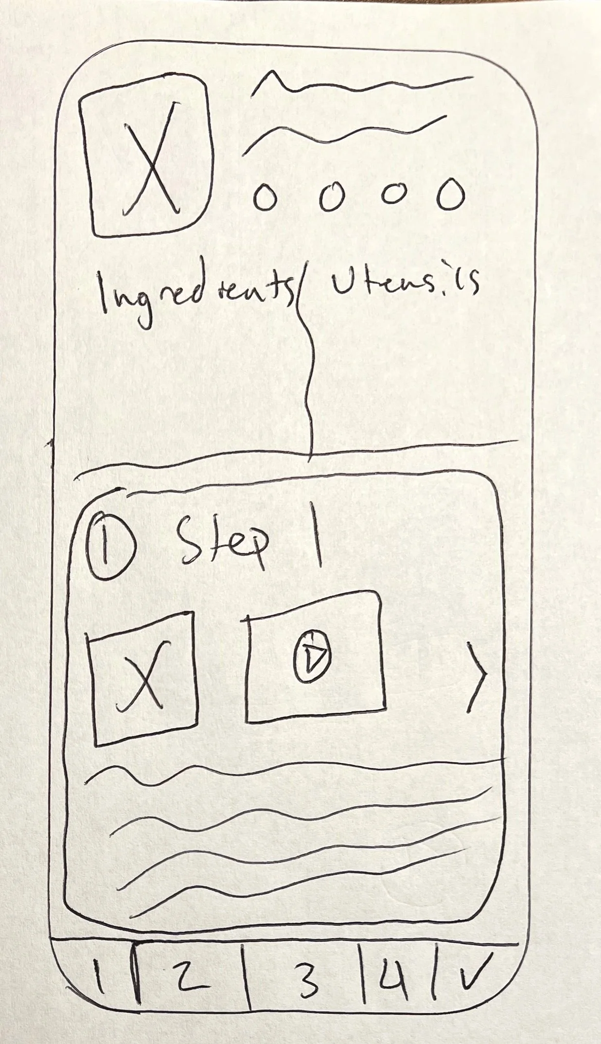
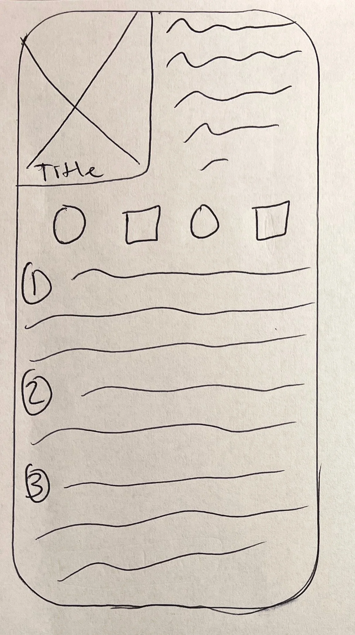
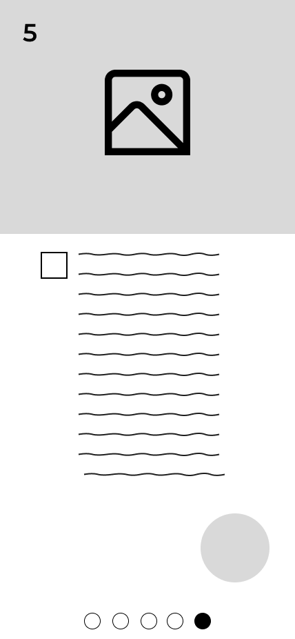
PROTOTYPING
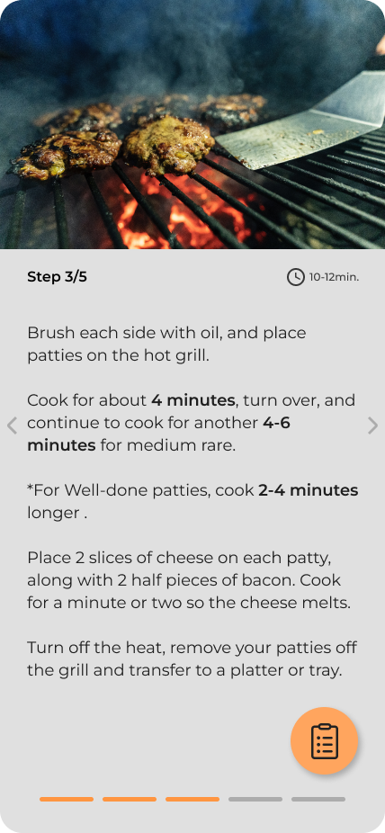
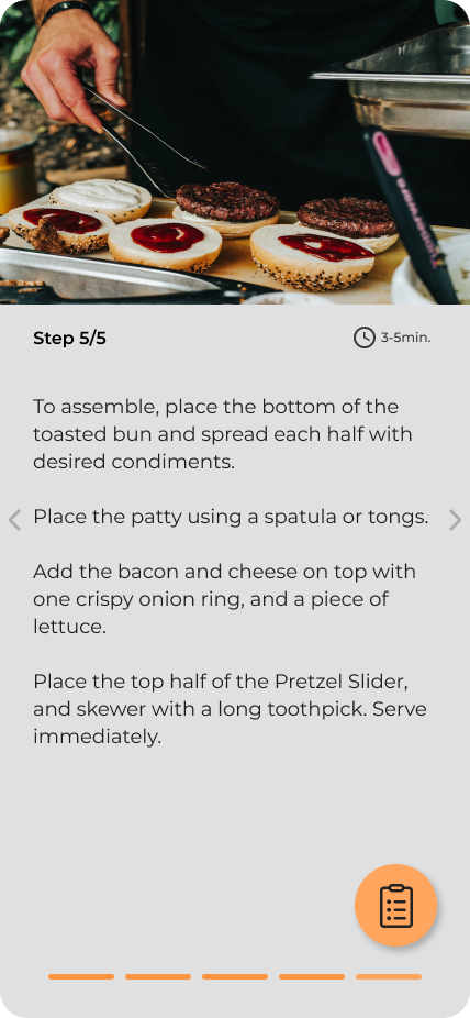
On day four, I began by turning my storyboard into a minimally viable product prototype. I implemented interactions like navigation arrows, pagination, tabs, and a 'cooking time’ feature. While these may not be essential to an MVP, I felt that these were key elements to solve our problem and allow our users an easier and more informed cooking experience.
Rationale
As I began to bring my wireframes to life, I focused on Fitts’s law by considering size and proximity. I knew that in order to achieve our goal of designing an easier User experience, I would need big targets and simple actions for our multi-tasking Savr users.
Prototype


Day Five
TESTING
The 5th and final day of the design sprint called for a round of interviews. In this case, I used a guerilla testing method and politely accosted 5 people at a nearby park who were willing to let me crash their party. I interviewed each participant for about 8-10 minutes and had them complete four tasks to familiarize themselves with the prototype.
Task List
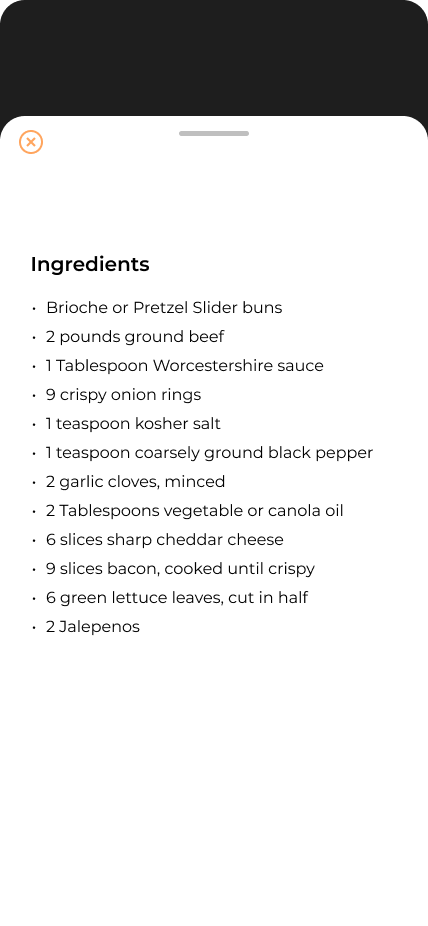
Read Recipe for ‘Western Slider’
Learn more about cooking times
After you’ve started cooking, refer back to the ingredients list
Use your knuckle or elbow to advance to the next step
“I’m not a great cook but I feel like I can be pretty independent with this.”
-Perry, 63
Key Findings
The font size was too small
Pagination was often confused with navigation arrows
All 5 users tried to swipe between steps instead of tapping next
Users felt informed enough about the content on the dashboard overview to confidently proceed
Appreciated the emphasis on cooking times throughout the prototype
One user would have liked to see an overview of all steps before proceeding
Touch areas worked with occupied hands - users could all use elbows and knuckles to advance the recipe
Takeaways
Navigation between steps had a learning curve. All of my interviewees, as Jakob’s law states, expected my app to move between pages in a way that is familiar to them from using other products. They expected a swipe, not a tap.
I didn’t get any valuable feedback surrounding the ‘Cooking time’ interaction on the Recipe Overview screen. Since I led them to it with the way Task #2 was worded instead of them naturally finding and interacting with it, I diminished any organic and unprompted observations.
Overall, Interviewees felt confident enough with Savr Recipes to choose and cook a new recipe properly.
Savr the Flavr
An MVP prototype of the end-to-end user experience