

CIRKEL

A Case Study by Austin Meldrum
Introduction
I partnered with Berlin-based CIRKEL, a startup in the world of digital coaching and training, to create a stunning MVP deliverable for fundraising objectives and business advancements.
Problem Space:
Employees often feel hesitant or unsafe to take risks within their organization or workplace. Whether out of fear of punishment, repercussion, etc, employees are increasingly afraid to be honest and voice their feelings regarding an idea they have or a mistake they’ve made. This leads employees to feel psychologically unsafe within their organizations - an issue that leads to poor efficiency, increased employee disengagement, and high turnover costing an estimated $600B yearly.
As employees feel diminished psychologically safety, they begin to lose trust and motivation, and they feel increasingly lonely and isolated. Without a proper environment or space for employees to speak freely and honestly about their ideas, feelings, concerns, etc, they are more likely to disengage and leave an organization.
A Solution:
Design a platform for employees to co-create their own psychologically safe support group within the structure of their organization or workspace.
Within this space, employees will participate in consistent sessions following the CIRKEL Method, a science-based methodology designed to facilitate the practice of interpersonal skills and building of trust. Employees become more engaged, motivated, and better contributors when they feel psychologically safe.
My Role:
Working as a dynamic team of 3, with members on both coasts, I acted as Project Manager, as well as UX Strategist, UX Designer, UX Researcher, UX Interviewer, and UI Designer.
Created, Owned and managed Project plan
Conducted and planned Weekly meetings and mid-week check-in calls
Held team accountable for deadlines, standard of quality
Effectively communicated with Stakeholders regarding project scope, goals, and expectations
Requirement definition
UX Strategist
Understanding
Understanding both the Client and the Problem Space
When we first met the CEO and Stakeholders, our strategy was to start by learning of their product, vision, brand identity, their understanding of UX, and some understanding of the stakeholders themselves. Since CIRKEL was still in its infancy, we translate the conceptual vision of the CEO into more palatable bites.
Clearly define our role for this project as well as the requirements for success. Those included setting the expectations and limitations, as well as tangibles like previous research, assets, timelines, and deliverables.
The first few days with CIRKEL were focused on developing a UX Strategy. At this point, CIRKEL had only lived conceptually with very little tangible visuals to communicate with. We wanted to understand the CEO’s vision for how the digital product would live and what problems they intend to solve.
We created a comprehensive project plan that captured all of the requirements, deliverables, timelines, and responsibilities for all team members on this project. We established lines of communicate and meeting schedules. Lastly, we conducted a reality check to make sure that we as a team of 3 would actually be able to chew the bite we had just taken.
Discovery
Primary Research to understand our client and the problem space
Competitive Analysis
To begin the Discovery phase of our design process, we needed to gain a thorough understanding of the user, the problem, and the industry we are playing in. Amy, Eric, and myself each performed a Competitive Analysis, but to avoid redundancy, we took a three-pronged approach and each went about competitive analysis from a different perspective.
Amy’s competitive analysis focused on the brand positioning of major competitors in the Digital Coaching space, emphasizing both brand aesthetic and digital composition. Below, Competitive Analysis research created by Amy Sit. Click to Enlarge.
Eric researched Business Models of several competitors while analyzing perceived strengths and weaknesses in their messaging and digital presence. Diagram below created by Eric Wang. Click to Enlarge.
I performed Competitive Analysis by conducting an Expert Review and UX Audit. I chose 4 related industry leaders to identify commonalities, patterns, brand aesthetic, calls-to-action, and how each competitor focused on their user(s) both with each brand’s UX as well as their respective business model. Diagram below created by Austin Meldrum. Click to Enlarge
RESEARCH
Conducting User Interviews to uncover our user’s problems and persona
Some Context:
When Amy and I began formulating our questions list, we wanted to keep our overarching themes the same for both user types. We did this to understand both sides of the peer group coin — what is the experience like from a coaches perspective and what is the experience like for the participant? The primary themes were;
Influence of Technology
Measures of Success
“Psychological Safety’
Peer Groups
By the Numbers
User Interviews, which were organized and conducted by Amy and myself, were divided into 2 groups, Participants and Coaches. Amy interviewed the ‘participants’ (people who have used Peer Groups in the past), while I interviewed the ‘coaches’.
7 Total Interviews
4 Peer Group Participants
3 Life/Career Coaches
2 CEOs Interviewed
50+ Total Years of Coaching Experience
“Your goal as a facilitator is always to ‘set the container’ and lead by example.”
‘Coach’ Persona
This persona was created by synthesizing our research of professional coaches/facilitators with a variety of coaching expertise. This persona allowed us to design not only with the Coach in mind, but to learn about facilitating a successful program and to implement strategies into our initial design.

‘Participant’ Persona
This persona was created by synthesizing our research of participants in peer groups and training programs. Our design team knew early on through our collaboration with Cirkel Stakeholders that they want to design a digital product with experiences for both an end User (Participant) and for an administrator (Coach).

DESIGN
Converting mental models into pixels
Our research and creation of Persona types helped us determine 2 critical User Flows needed for our MVP to succeed. We prioritized a FTU flow into a User Dashboard, as well as a Meeting Page/participant group call leading into a post-call evaluation - something that was very important to the CEOs.
User Flow 1 (Top): Landing Page > Login/Registration > Assessment
User Flow 2 (Bottom): User Dashboard > Meeting Page > Evaluation
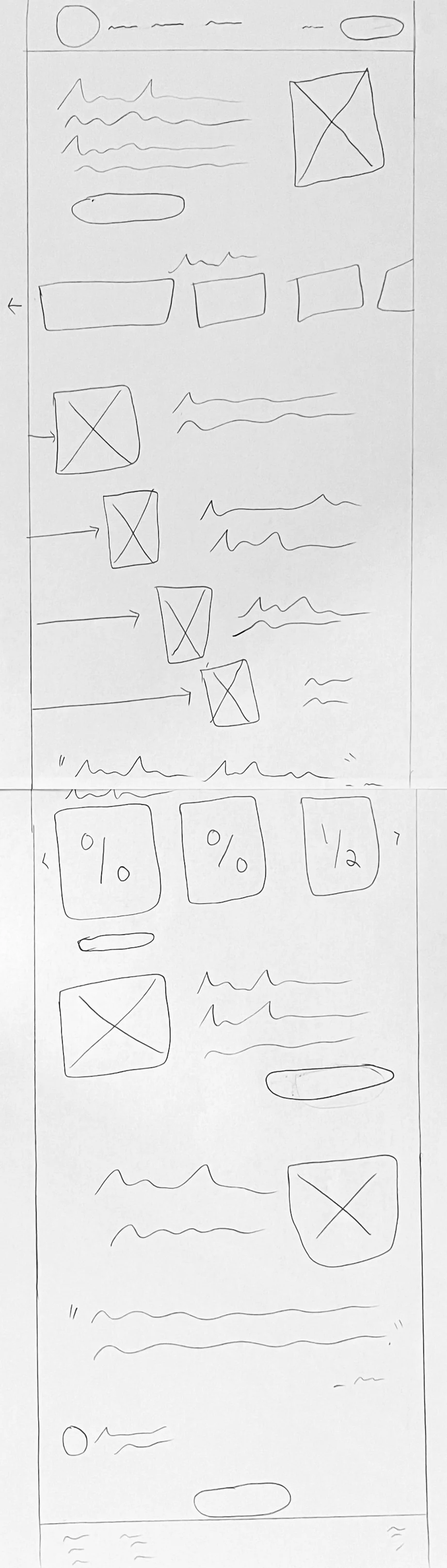
Sketches:
To begin the design stage of our process, Amy, Eric, and I each sketched some variations of our user flows. Collaborating as a team, we were able to refine the best elements of our sketches, address some key questions, and synthesize our sketches into a final design sketch with which we would create a wireframe. Eric took ownership of Flow 1 (Homepage to assessment) and I began sketching Flow 2 (Dashboard to Meeting Place to Exit Evaluation).
After our team split up to draw our sketches, we regrouped to collaborate and discuss our results. We decided to share our sketches and redraw as a group, choosing which pieces we could combine into a comprehensive yet usable experience and which elements we could reduce or eliminate.
Design Rationale:
When ideating and sketching our crucial User Dashboard page, we liked the idea of alarge ‘play meeting’ button (as seen in Version 1), but thought it was a bit too big, so we reduced the size but still kept it centered and focal.
The progress indicator was given too much space on an already cluttered dashboard, so we reduced the size and combined it with other metrics and visual data representations (a direct finding from our User Interviews).
See Image Carousel Below
-
![]()
Homepage Sketch
-
![]()
Dashboard Sketch: Version 1
-
![]()
Dashboard Sketch: Version 2
-
![]()
User Dashboard Sketch: Final
-
![]()
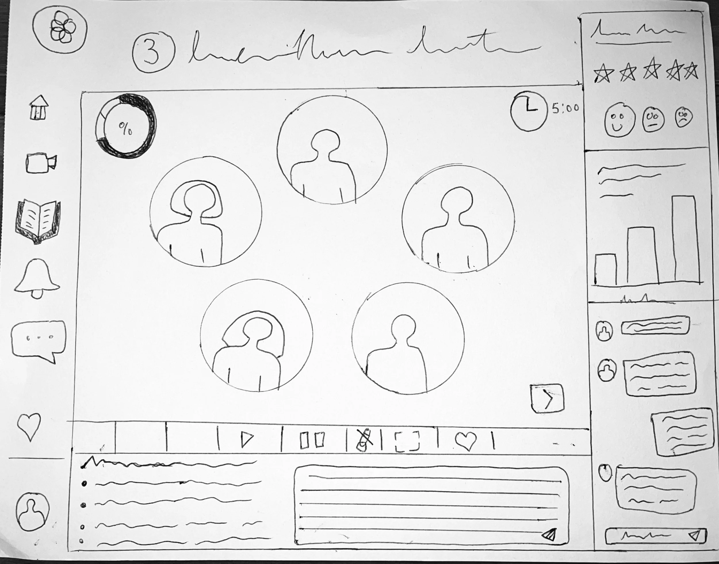
Peer Group Video Call Screen: Version 1
-
![]()
Peer Group Video Call Screen: Version 2
-
![]()
Peer Group Video Call Screen: Final Sketch
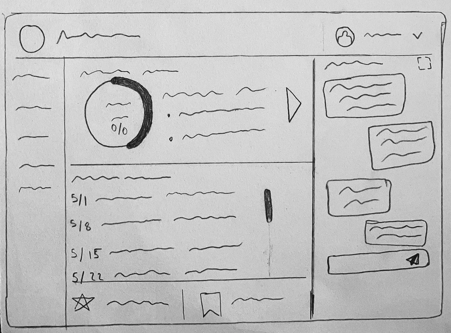

Wireframes:
To begin the design stage of our process, Amy, Eric, and I all sketched some variations of our user flows. Collaborating as a team, we were able to refine the best elements of our sketches, address some key questions, and synthesize our sketches into a final design sketch with which we would create a wireframe. Eric took ownership of Flow 1 (Homepage to assessment) and I began sketching Flow 2 (Dashboard to Meeting Place to Exit Evaluation).
See Image Carousel Below.
-
![]()
Participant Dashboard Screen
-
![]()
Enter Meeting Place 'Check in' Modal
-
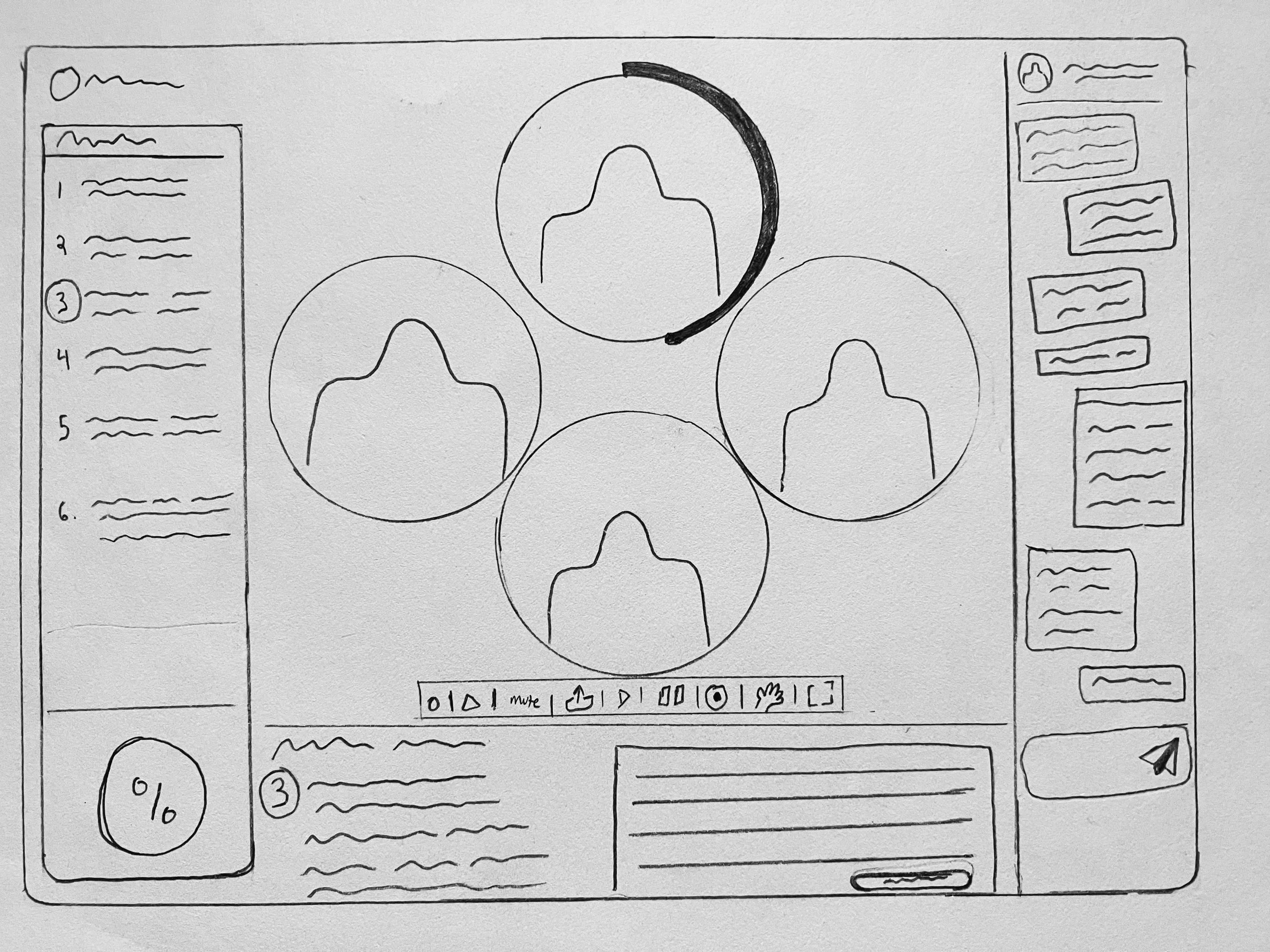
![]()
Peer Group Meeting Screen
-
![]()
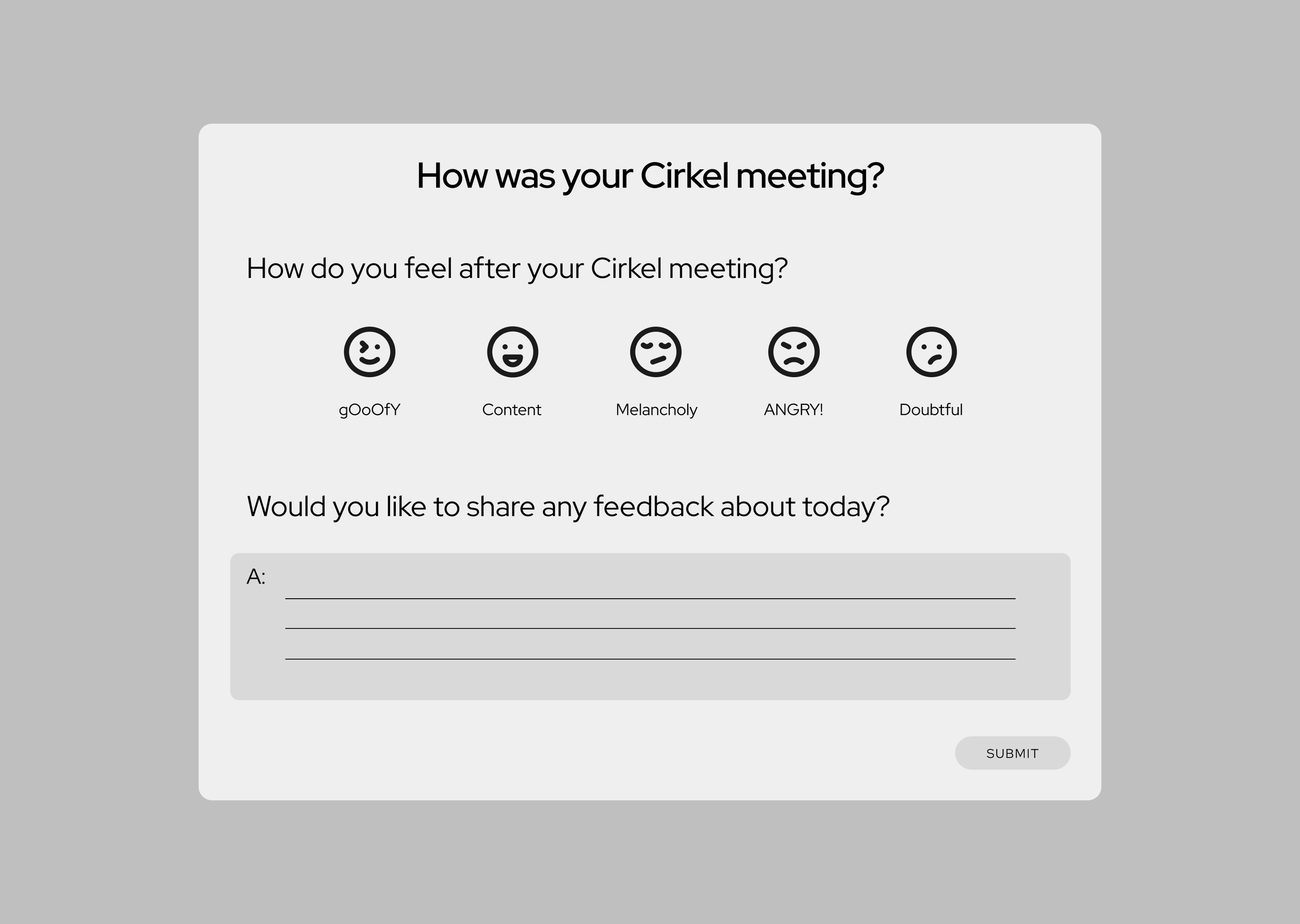
Exit Meeting Screen 'Check Out' Modal
-
![]()
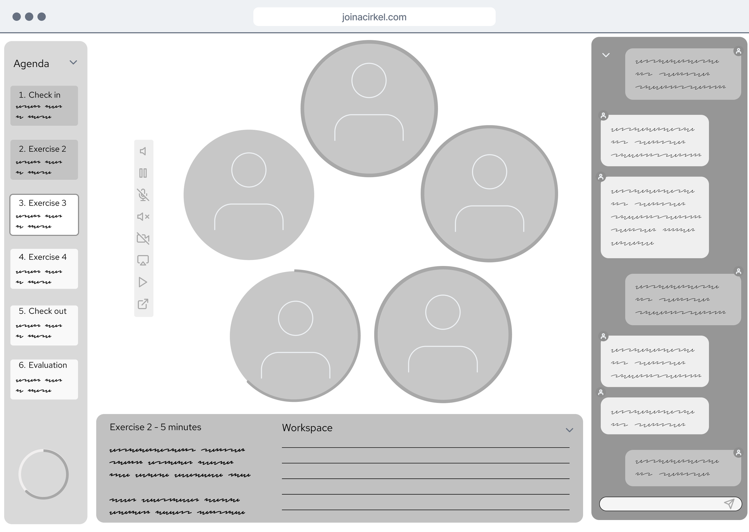
Peer Group Meeting Full Screen

Usability Testing: Wireframe Prototype
Once we had our user flows sketched out and digitized into wireframes, we presented them to our stakeholders to get initial feedback and ask a few questions that came up during the wireframing process. With this input, we made a few small edits and additions and then set out to recruit 5-7 people for Usability testing. With ownership of Flow 2 in particular, I formulated a list of key Tasks for the user to complete during our tests.
Usability Test Task List
Start or Join a Meeting
Ask a question to your peer group
Open and Close each of the task panels while in your meeting
Expand your meeting screen into full screen view
Give your session a rating and feedback
Test Findings
We found that the Expand/Minimize Screen Icon was difficult to find and interact with
CTA were not as specific as needed
Terminology between ‘Meeting’, ‘Peer Group’, ‘Cirkel’, and ‘Course’ was confusing and redundant to the user
Refinement of side panel categories such as saved vs library is needed as there was no clear distinction between the two
Visual cues, such as central meeting timer, were not clearly understood
Scalability need more thought - current design does not allow for a User enrolled in multiple courses. Where would all courses be listed? How would progress through multiple courses be reflected on the dashboard?
Given the obvious constraints of a static wireframe, Users were asking about some elements being dynamic, such as the workspace adjusting to the exercise required.
Users expressed a desire to share reactions/emojis in the chat forum.
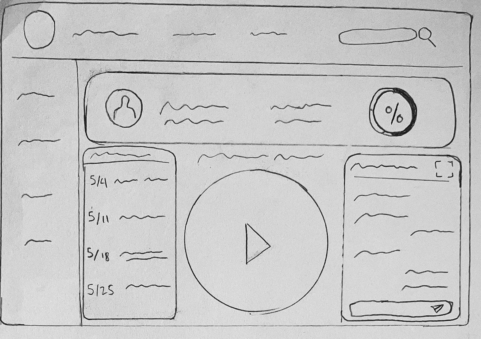
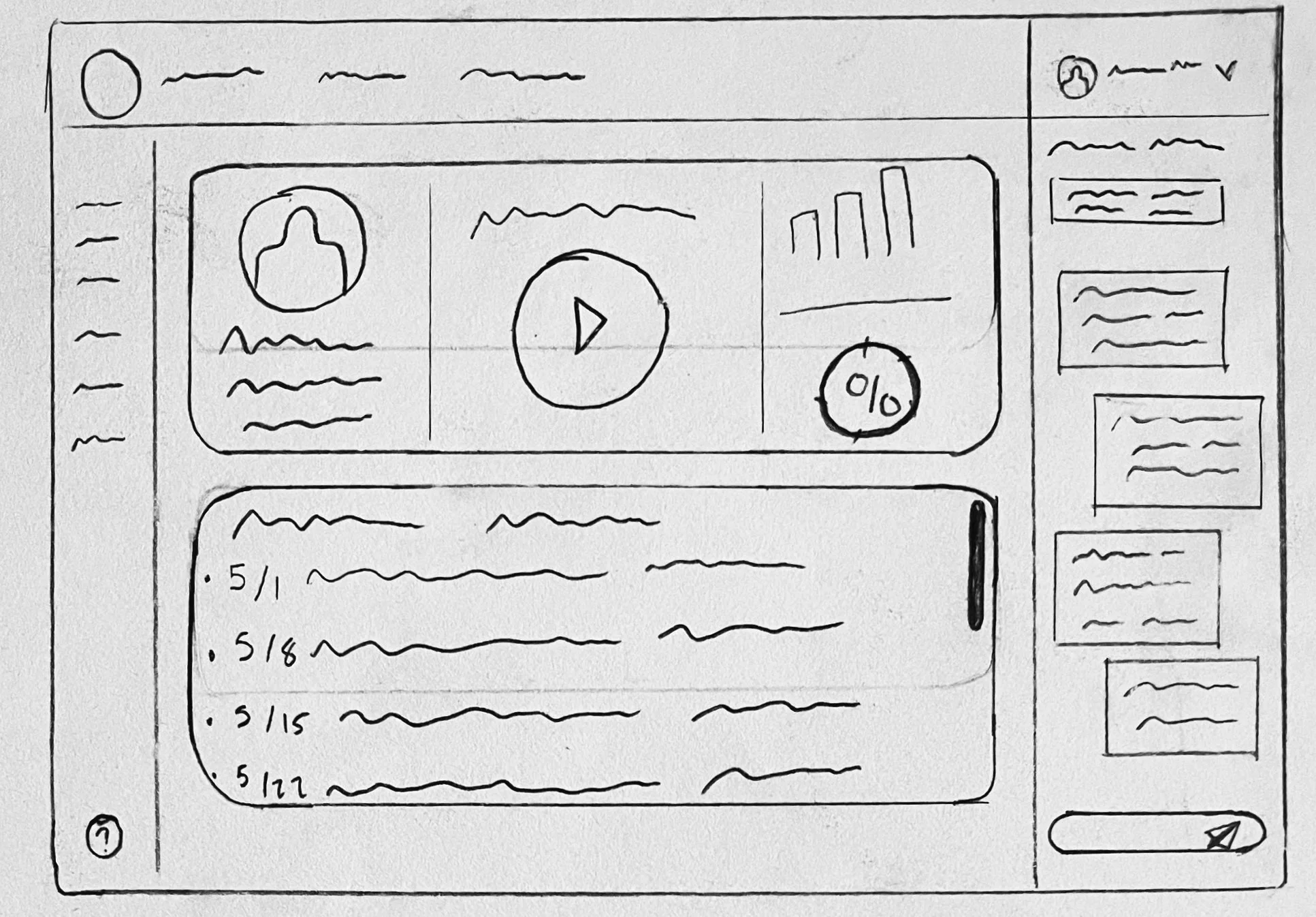
High-Fidelity Prototypes
To begin the design stage of our process, Amy, Eric, and I all sketched some variations of our user flows. Collaborating as a team, we were able to refine the best elements of our sketches, address some key questions, and synthesize our sketches into a final design sketch with which we would create a wireframe. Eric took ownership of Flow 1 (Homepage to assessment) and I began sketching Flow 2 (Dashboard to Meeting Place to Exit Evaluation).
-
![]()
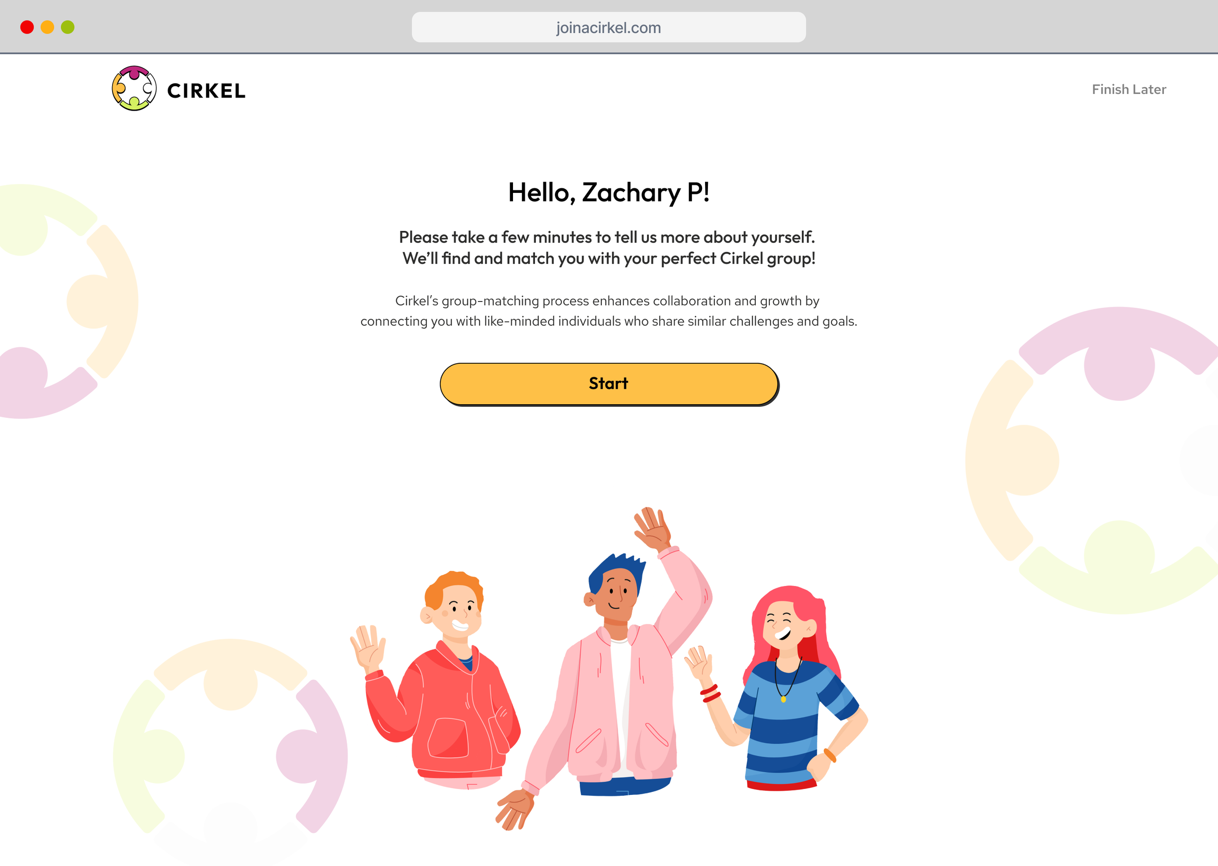
FTU - Assessment Start
-
![]()
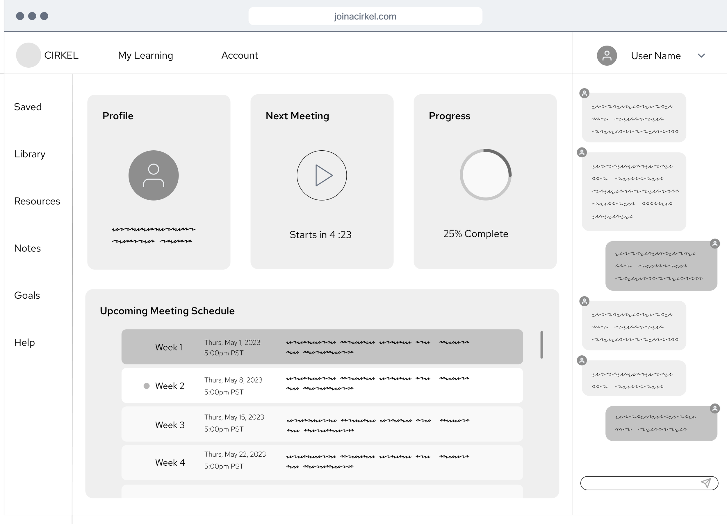
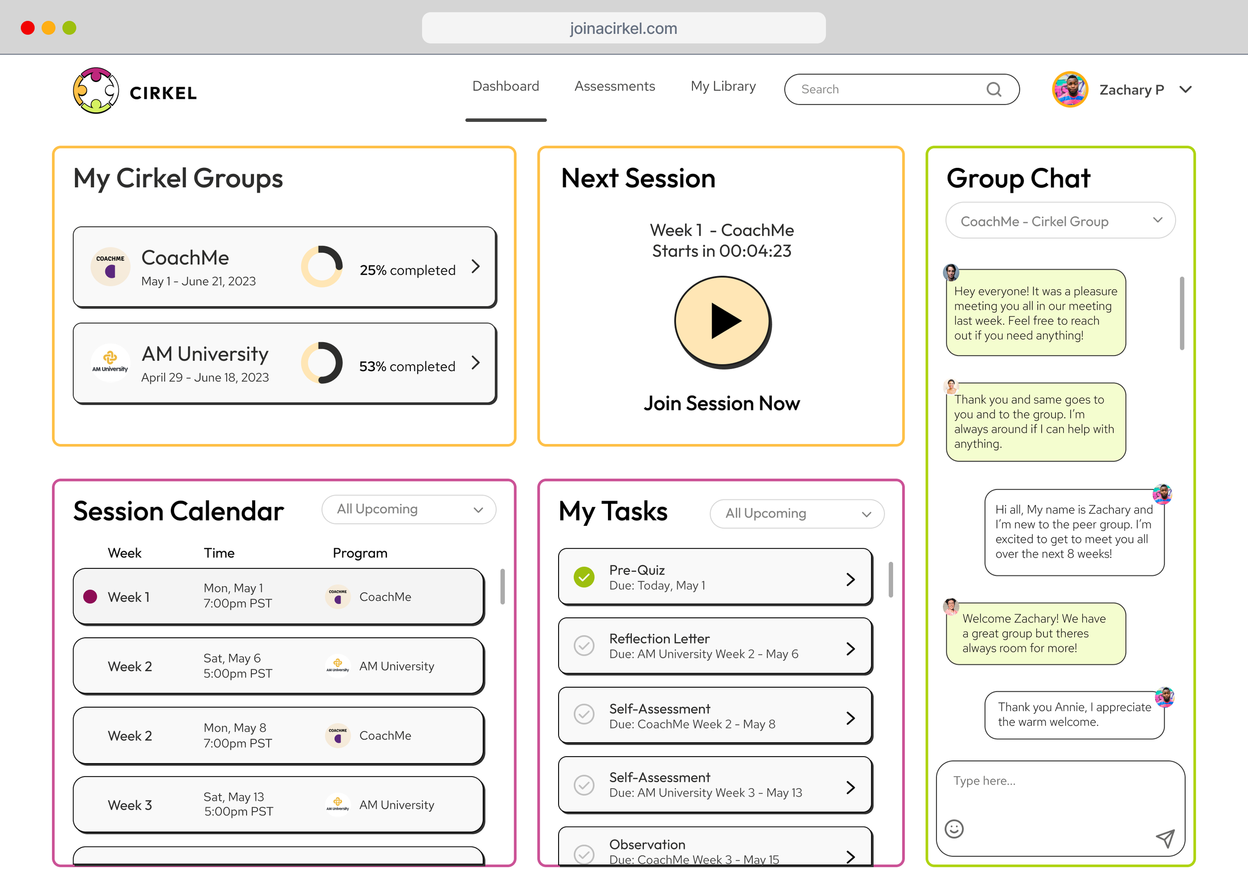
Participant User Dashboard
-
![]()
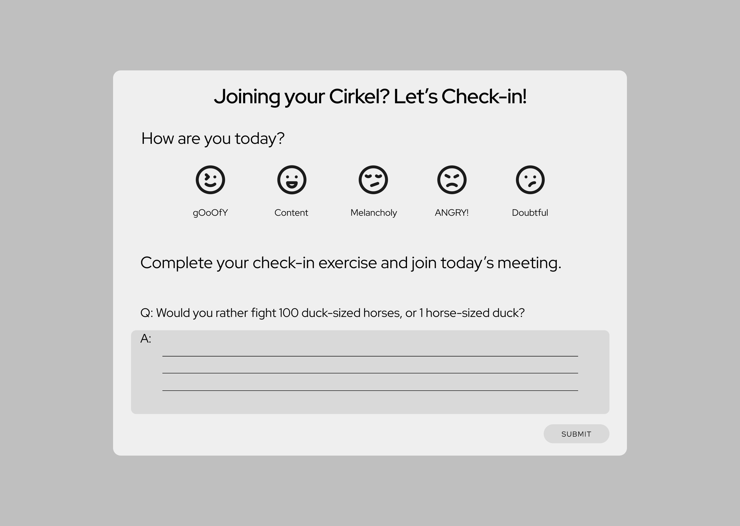
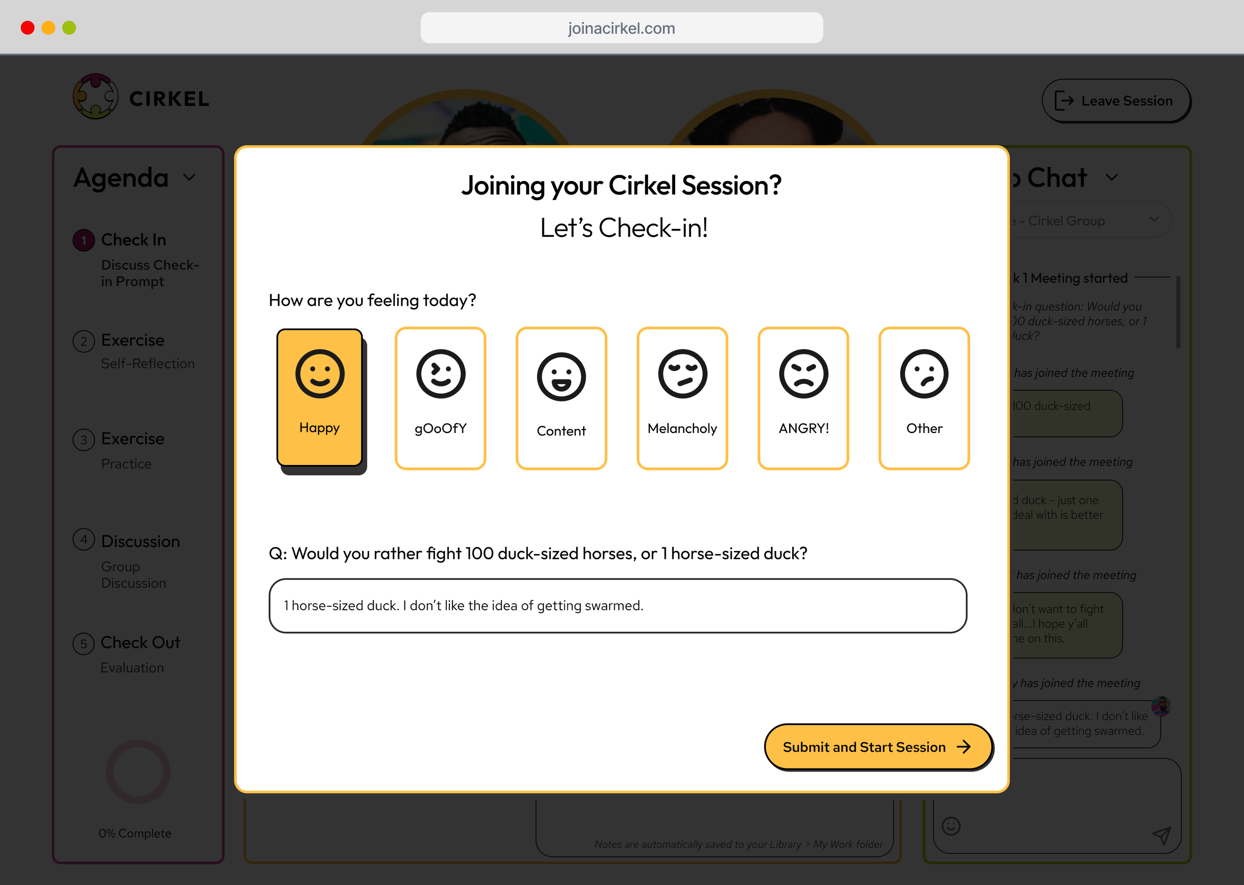
Enter Meeting - Check-in Evaluation
-
![]()
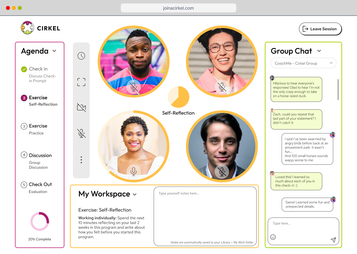
Meeting Screen - Drawers open
-
![]()
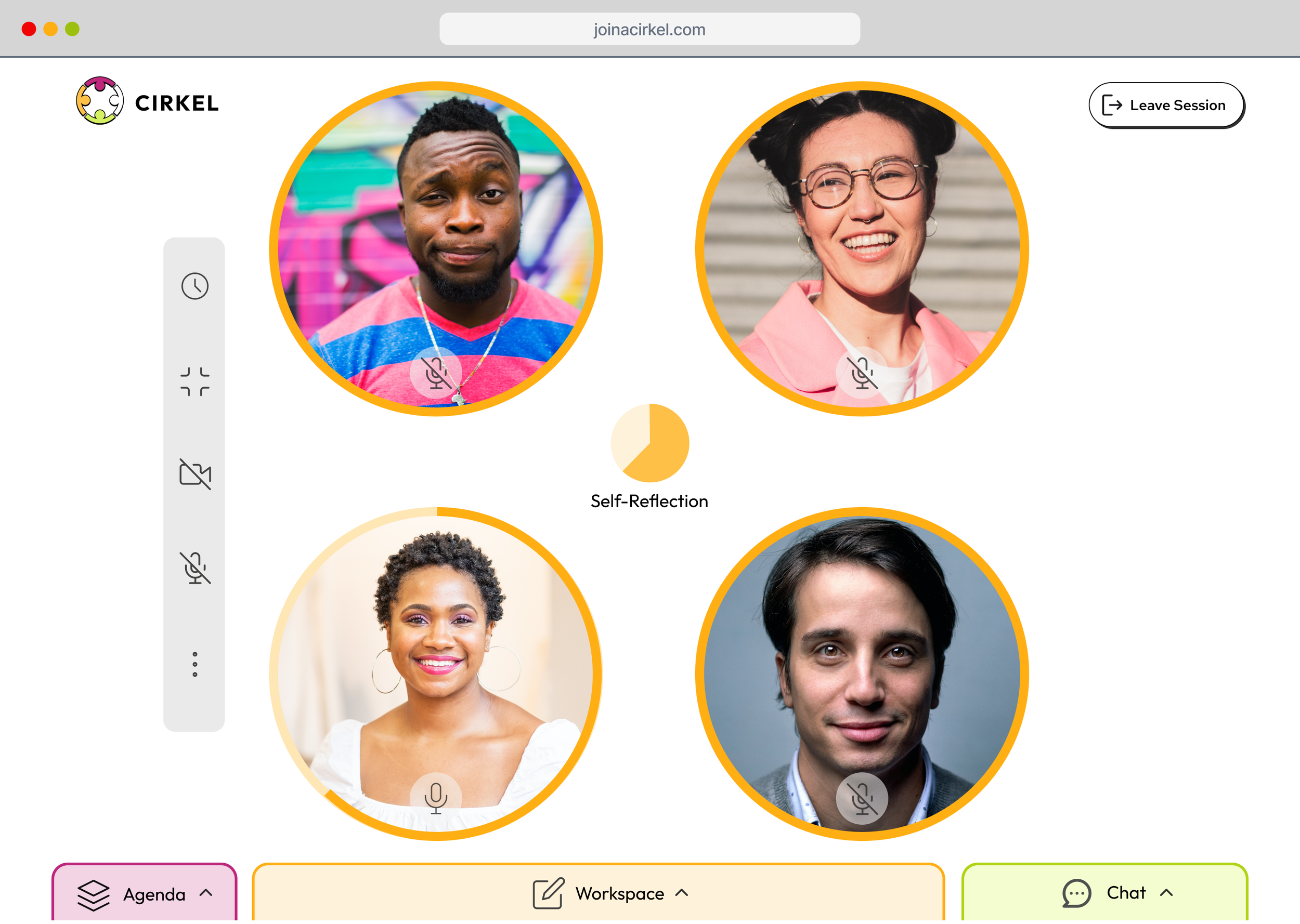
Meeting Place - Full View with Drawers Closed
-
![]()
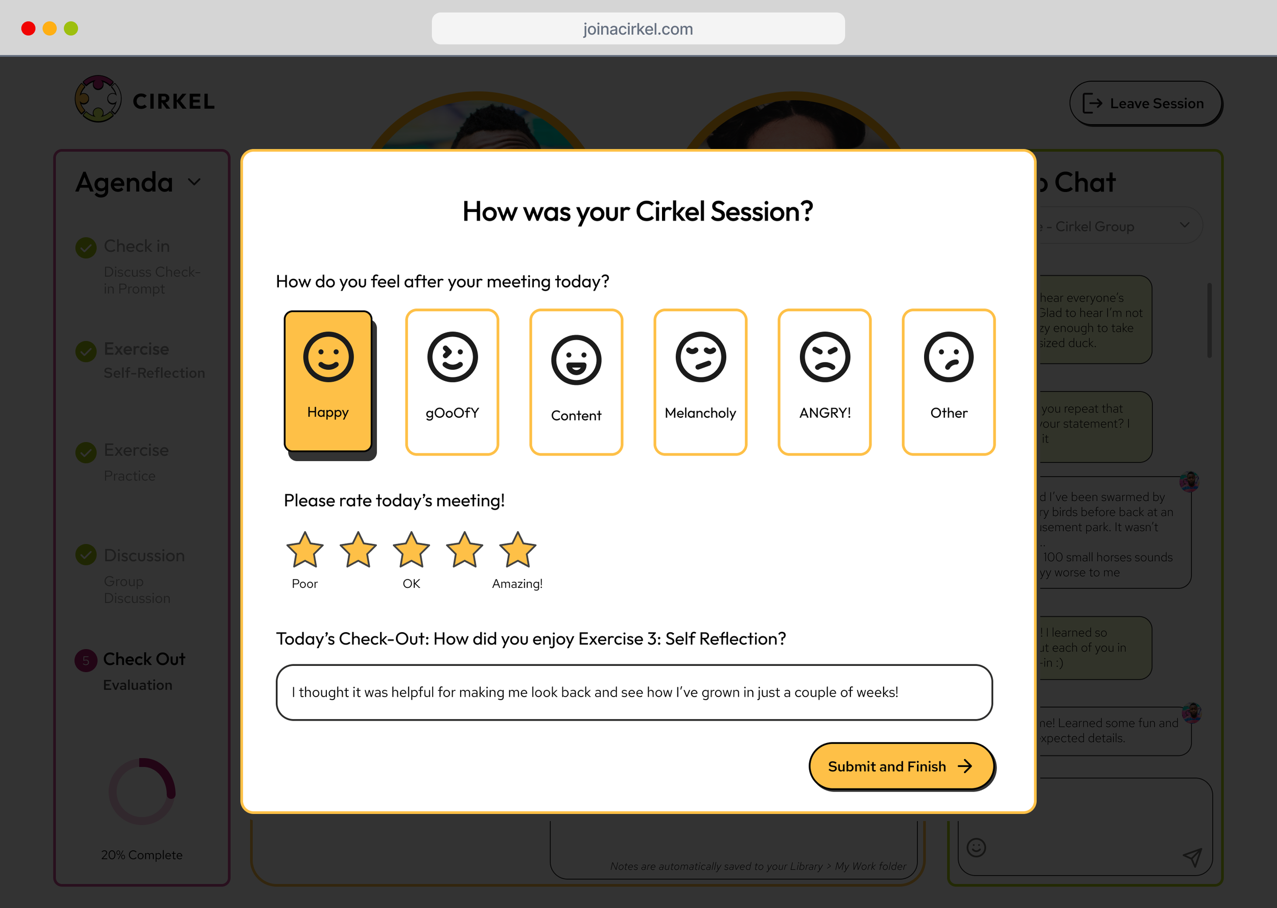
Meeting Close - Check Out Evaluation
High-Fidelity Prototypes
A Fully-animated MVP ready for the client.
Homepage to FTU Assessment Flow
FTU Assessment Flow
Participant User Dashboard to “Check-in” Evaluation Flow
Leave Meeting “Check-Out” Evaluation Flow
Meeting Screen - Drawers Opened and Closed
Meeting Screen - Expanded and Collapsed View
Thank You for Reading
The CIRKEL team